net stuff

Showing lots of options in Contact Form 7

Contact Form 7 is a widely used WordPress plugin that offers a fair amount of flexibility, but I needed for it to do something it didn’t want to do: I wanted to display a form with a lot of options and make it look good. Normally one would do this using radio buttons or a dropdown menu. Because scrolling through long dropdown menus is especially annoying, I opted for radio buttons. But then I wound up with a long blob of radio buttons I wanted something with some structure: columns and headings.

CSS to the rescue. The following is not perfect (there are some limitations on selectors that prevented me from getting as fancy as I wanted), but I consider it a big improvement.

First, use the “Generate tag” option to create a radio button. Set an ID for the radio-button set. In this example, it is recipientlist. Enable the “Wrap each item with <label> tag?” option. This CSS is dependent on the tagging that option produces. You could rewrite this to work the other way, but it’s friendlier to turn that on anyhow.

Second, create your list of options. You probably want to do this in a text editor, not the CF7 editing window. Organize your options into sections, and insert new lines with section headings where appropriate. Begin each section with the same word–in the example shown below, I’m using “Area”. If you’re using piped options, it doesn’t matter what comes after the pipe for these section headings. Paste your completed list into the “Choices” field

Third, gank the following CSS:

<style>#recipientlist {
display: block;
-webkit-columns: 3 150px;
-moz-columns: 3 150px;
columns: 3 200px;
}
#recipientlist .wpcf7-list-item {
display: block;
margin: .25em 0;
}
.wpcf7-list-item input[value^=Area] {
display: none;
}
.wpcf7-list-item input[value^=Area] + .wpcf7-list-item-label {
font-weight: bold;
}</style>

and paste that right into the CF7 “Form” field, right at the top. Change #recipientlist to whatever ID you are using for your button set. Change Area to whatever you are using as the lead-in text for your section headings. Do not introduce any extra line breaks into this, as WordPress will add tags that you don’t want. Do not try inserting this into your theme’s styles.css document or via other style-injecting mechanisms, as parts of this will get overridden and you will be sad.

Your radio-button tag should look something like this:

[radio recipient id:recipientlist use_label_element *lots of options follow*…]

Copy that code and paste it wherever you think it belongs in your form. The style element should be at the top though.

You may want to play around with the number and width of columns, depending on your theme and the content you’re presenting.

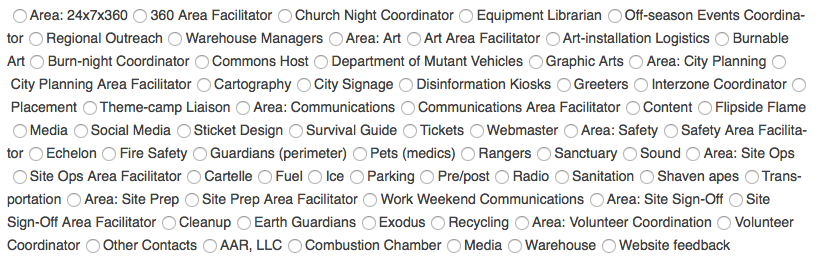
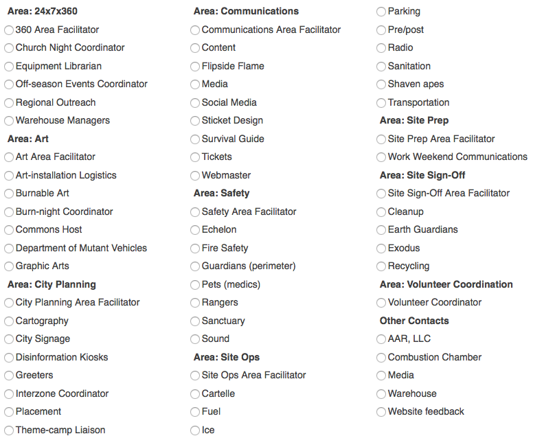
Here’s a before and after.

Before:
before

After:
after

This isn’t perfect–there’s no way to control where the column breaks occur, or to show the sections as blocks of equal height. And it’s not semantically correct HTML. But it’s an improvement.

[Nerd mode=on]
There are four CSS rules here. The first one forces the set of buttons to show as a separate line, and breaks it into columns. The second forces each button to display on its own line. The third picks up buttons that begin with the section-identifying word “Area”; hiding the radio button and setting some margins. The fourth styles the label text for those section heading buttons.
[Nerd mode=off]

Islands vs Continents

If you look at just one aspect of sharing information on the web, there are two approaches: islands and continents. Islands are bunch of individuals, each with their own corner of the web, where they publish whatever they want. Continents are where a bunch of individuals all sign up for user accounts and interact through that site’s back end. This post got me thinking about this, and this response got me thinking more about it.

Islands are anything that the user runs in their own web space: such as this blog or a self-hosted photo gallery. Continents are big destination sites like Facebook or flickr.

Continents do have their appeal: for one, they’re easier for the user to get started with.

More importantly, there are more ways to make money off them: advertising, membership fees, selling user data. With islands, the methods for monetization aren’t the same: you can sell the software, and maybe you can sell a support package to go along with it. The notorious difficulty of getting people to pay for anything on the web may explain why the software underlying islands tends to be open source, though there are exceptions. Beyond just the immediate revenue model, a popular website is exactly the sort of thing that its creators can hope to sell to one of the big boys for big, big money (like Instagram selling out to Facebook for [pinky to lip] one billion dollars). Software projects…not so much.

Continents have one huge disadvantage: most of the big ones are supported through advertising and the sale of user data, and as has been said many times, if you’re not paying for it, you’re not the customer, you’re the product. It is in Facebook’s interest to make their site appealing to the extent that it keeps us around long enough to show us more ads, but not necessarily in their interest to really do right by their users.

The advantages of islands may only appeal to nerds: you controls your data, how it looks, how it’s used. Nobody is selling advertising around your data.

In theory, there’s nothing preventing me from hosting my photos in my own web space, even though I don’t. Back in the old days, web space was doled out in such small parcels that it would have been unrealistic for me to throw everything up there. These days, that’s not such a big deal. But flickr, for all its faults and neglect at the hands of a company that doesn’t know what to do with it, still has features that I haven’t seen in self-hosted photo galleries. One of these is that your photos can be viewed in the context of photos by other people: other people can follow your photos can comment on them. You can post them to groups that are organized around a topic or theme. You can organize galleries of photos by other people. You can see other photos that have all been tagged Tokyo or whatever.

In short, because you’re on a continent, you don’t need any bridges to get around. This social connection is huge, and it’s the weak spot of islands. All the island software out there works on one island in isolation. It doesn’t include bridges to your neighbors.

Diaspora is a social network based on the island + bridges model. Perhaps I should say based on a “big island” model, since most pods (as they’re called) have a lot of users, but there are many pods and they all intercommunicate. This is a promising idea, but Diaspora gets discouragingly little use. I’ve got 37 contacts on Diaspora. Two of them use it. Part of this is a chicken-and-egg problem, but Facebook also has useful features (events and invitations, groups, etc) that Diaspora lacks.

The only things that Diaspora has going for it is that you actually are the customer (they run on donations), and you own your own data—stuff that a lot of people just don’t think that hard about. But it’s a big deal. Now that Facebook has gone public, it needs to justify itself to shareholders, and there will be even more tension between doing what’s right for its customers vs its users.

I want it both ways. I want to have control over my data, and not to be someone else’s product. And I also want to connect with my friends and with people I don’t even know yet.

The Diaspora guys have the right idea, and so does Brent Simmons: we don’t just need islands. We need bridges to connect them.

Update: This is the kind of thing I’m talking about

Gamification

Brent Simmons writes about gamification, saying

you could look at this trend and say, “As software gets simpler, it gets dumbed-down — even toddlers can use iPads. Users are now on the mental level of children, and we should design accordingly. What do children like? Games.”

I’ve been thinking about gamification a little for a while now, and I think it’s actually more sinister than that. Look at a website like Stack Overflow. They’ve got it set up with this treadmill of meaningless rewards to keep you engaged in the site, asking and answering question. In addition to increased ad impressions (which is cynical enough, the sole point of a game like Farmville, which has no rewards that I recognize as such), your labor makes the site more valuable: a good “answer site” like Ask Metafilter (which is a cool community, not an exploitative business play) gets very high Google rankings—Stack Exchange clearly want to cash in on that action getting strong Google rankings for their own site, leading to more pageviews, and the circle of life continues. For your efforts you get a gold star. A virtual gold star. But they’ve figured out that points and achievements activate some hindbrain reward center that they cynically play off of.

In my own vocation of translation, there’s been an increasing trend toward uncompensated crowdsourcing (another hot-button word) as an alternative to professional work, and I fully expect to see gamification tactics applied to that as well before long.

Twitter’s dickbar

Starting about two weeks ago, Twitter seems to have embarked on a program of doing it wrong.

  1. They have told independent developers not to bother writing primary clients for interacting with the service.
  2. They have (finally) announced that they are shutting down DabbleDB, a wonderful service that got caught up when Twitter bought out the company behind it for unrelated technology (Trendly).
  3. And of course, the dickbar.

A lot of people have written about the dickbar, a misfeature of the official Twitter iPhone app. The first version had a misbegotten interface that covered over your timeline until you played around with the phone. The second version was an improvement in UI terms, but still a misfeature in that it emphasizes information that I don’t care about (nor anyone else who has complained about it): showing global trending keywords among Twitter users.

Obviously the big reason behind the addition of this misfeature is money: it puts “promoted trends” front and center. But even apart from the monetization angle, it feels like evidence that Twitter is guiding people away from using the service the way, well, we do use it.

Twitter was conceived as a lightweight way to pass around status updates among acquaintances, and that is its greatest value to me and (I think) most people. The emphasis on trends seems to be designed to turn people into spectators rather than participants—trends answers the unasked question “what are people I don’t know talking about.” It doesn’t invite me into the conversation and it doesn’t relate to me or my circle of friends. I can see how it’s useful to, say, marketers though.

This fits with another aspect of Twitter’s service that debuted a while ago, where it suggested people for you to follow—celebrities. I see that now, it suggests people who are actually friends of friends (and promoted feeds), so apparently they’ve fine-tuned that, but it’s evidence of the same shift away from participation toward spectation.

Twitter’s got a right to run their service however they see fit. And if they keep going down the path they seem to be following, I have a right to go somewhere else.

Department of redundancy department

form asking me what it's telling me.

I encountered this when setting up web access to my account with a utility. To get to this page, I had to enter my account number from one of my bills. Note the information provided at the top, and the information requested at the bottom.

Search tip

A couple of nights ago, Gwen used the phrase “Googling for something on America’s Test Kitchen” instead of “searching for…”, which just reinforces that Google has become a synonym for search.

Google search results are often polluted by irrelevant links to commercial websites like bizrate and dealtime, though. Wouldn’t it be nice if there were a way to avoid that? There is: use Give me back my Google.

It would be even nicer if you could search via GmbmG right from the search field in your browser. And in fact you can, but you’ll need to set it up first

Safari

Safari does not let you customize your search field out of the box, but there are some hacks like Glims that add this capability. Once you’ve done that, you’ll need to add GmbmG to Glims as a custom search engine and teach it the specific search syntax that GmbmG uses. It is:
http://www.givemebackmygoogle.com/forward.php?search= search key

Firefox or Internet Explorer 7+

These browsers support something called the “open search description document,” which makes adding a new search engine dead-simple. I have no idea how this works in IE, but in Firefox, just install this plugin (which I created, not the creator of GmbmG—the plugin is currently listed as experimental, but it’s perfectly innocuous, I promise) and it will add that site to the list of search engines your browser uses.

Standards, schmandards

When it comes to e-mail, I’m a plain-text kind of guy. But I know that some businesses prefer to use HTML-formatted e-mail, and thanks to Gwen’s new job, I’ve been learning way more than I ever wanted to about this. Long story short, it’s a nightmare. Avoid.

If you can’t avoid it (as Gwen cannot), you have to learn to deal with it. It’s a complicated problem because there are more renderers for HTML e-mail in frequent use than there are web browsers: in addition to client-side e-mail apps like Outlook or Mail.app, there are also web-based clients like Yahoo (which has two separate renderers, depending on whether you’re using old-and-busted Yahoo mail or new-hotness Yahoo mail), Hotmail, and Gmail.

Each of these has its own peculiarities, most of which can be managed without too much pain, except for one: Outlook 2007. Outlook ’07 actually has a more primitive renderer than Outlook 2003, using the renderer from MS Word instead of the renderer from Internet Exlorer. Word’s renderer uses a non-compliant mishmash of HTML 2.0 and HTML 3.2, with very limited support for CSS. There has been a movement among people who have to deal with this to get Microsoft to straighten up and fly right. Last week, Microsoft promised that they would not, provoking considerable gnashing of teeth.

I’m surprised at Microsoft’s response. They seemed to generally be moving in the direction of better standards support, if perhaps grudgingly so. While there is a legitimate argument to using Word’s HTML renderer in Outlook, this strikes me as a situation where they could have their cake and eat it too—in fact, there’s a recent precedent in Microsoft’s approach to HTML rendering with the compatibility mode in IE8.

It would be nice if the Word HTML renderer and generator were brought into the new millennium to emit and interpret standards-compliant code. It would also be nice if I had a unicorn that farted rainbows.

Short of that, it would be a relatively straightforward expedient for documents designed in Outlook around Word’s HTML renderer to include a header element like <meta http-equiv="X-UA-Compatible" content="Outlook=EmulateWord" /> or equivalent in order to invoke that renderer, otherwise relying on whatever the current IE renderer is. This would, admittedly, add some overhead to the app, but MS doesn’t seem to have any aversion to adding overhead to their code.

Austin Broadband Information Center

I recently wrote about the impending volume caps that Time Warner Cable will be imposing on its Austin customers, a move which has earned an angry reaction from many Austinites. I’ve seen an online petition in opposition to these caps. I’m not a customer of TWC, and frankly, I’d be just as happy for them to continue pissing off their customers, convincing more and more customers to leave, until TWC doesn’t have any customers left to worry about pissing off.

It is telling that TWC approvingly cites Canada as an example of bandwidth caps in action. Cory Doctorow, a Canadian citizen, has stated that he cannot live in Canada because Internet access there is so dismal. It is equally telling that TWC does not cite South Korea or Japan—where bandwidth that Americans can only dream of is common—as an example of the kind of Internet service they aspire to provide.

Anyhow, the tirelessly public-spirited Chip Rosenthal is actually doing something to help: he’s put together a website to serve as a clearinghouse on information on the subject: the Austin Broadband Information Center. Check it out.

They hate us

I’m starting to believe that American telecommunications companies actively hate their customers.

AT&T Mobility has just announced a change to their terms of service for 3G that basically makes any broadbandy use of it a violation of their TOS. Time Warner Cable has just announced monthly volume caps (these are sometimes called bandwidth caps, but that phrase strikes me as ambiguous), the highest of which will be 40 GB for $55 per month; overages will be priced at $1/GB.

Contrast this with Japan, where for about $35/mo, you can get a service with 47 Mbps downstream and 5 Mbps upstream. At maximum saturation, you’d burn through a 40 GB cap in 19 minutes. TWC’s lowest cap of 5 GB would take less than 3 minutes to burn through. Now, admittedly, nobody in the USA is getting that kind of bandwidth in the first place (I’m getting my carrier’s top level of service, which is about a quarter that speed up and down). And it should go without saying that NTT is not imposing any kind of caps on their service.

But wait, it gets better. Right now, Japan’s leading wireless carrier is field-testing the next generation in mobile broadband, a protocol called LTE (in the US, we call it 4G; over there, they call it 3.9G). This is running at 120 Mbps in their tests, and they plan on doubling that by the time it’s deployed commercially. At that rate, you could burn through a 40 GB cap in less than three minutes. Over the air.

American consumers are getting shafted by their telecommunications providers. Paying a nickel for a text message that costs exactly nothing to deliver is only the start. And let’s set aside spying on their customers for the NSA. With these increasingly restrictive terms of service and tariffs, I get the impression that carriers not only want to limit our expectations, they want to lower them.

I can’t explain the difference in pricing and service between American and Japanese companies, I can only speculate. And my speculations sound like a conspiracy theory.

Over the last ten or so years, we’ve seen Enron used as an inspiration for running the entire economy. A friend who used to be a muckety-muck at a cellphone maker said that telecommunications companies ultimately want to move towards a tithing-based pricing model—where you pay them a certain fraction of your income.

I have to imagine that in the boardrooms of AT&T and TWC, they rub their hands with glee at how they’re finding new ways to screw over their customers, just as Enron traders chortled over “aunt Tillie” sitting in the dark because they had engineered a power outage. That may sound over the top, but there’s definitely something about these companies that makes them want to provide the shittiest service they think they can get away with, not the best that is technologically possible.

And the thing about communications is that there’s really no way to “save up” those bits or bytes. Every second that fiber is dark is a second you can’t get back. Volume caps create an artificial scarcity where none exists.

Backing up your Delicious library on a Mac

The recent implosion of Ma.gnolia and a growing skepticism of entrusting your data to the cloud got me thinking about the data I’ve got that’s “out there.” One particular point of vulnerability is Delicious, where I keep my bookmarks.

Fortunately, Delicious makes it pretty easy to download all your bookmarks if you know what you’re doing. Unfortunately, you have to know what you’re doing, at least a little.

With that in mind, here’s a simple Applescript that any Mac user can run to create a backup. Delicious requests that you do this sparingly, so I’d recommend doing it only, say, once a week.

To make this work, open Script Editor on your Mac (it came with it, and should be lurking about somewhere unless you deleted it) and paste the following into it, changing the username and password. There may be a linebreak on the last line—edit it so that it is all on one line. Save it using “Application” as the file format with whatever name you like—this will result in a mini app that you can double-click to run.

Running it will create a file called deliciousbackup.xml in your Documents folder. That file will not be in the most readable format, but it will have all your data. Each time you run it, it will overwrite the previous version of the file. It would be possible to do multiple snapshots, but I haven’t gotten that fancy.

set thefile to "deliciousbackup.xml"
-- change myusername to your username, keep the quote marks
set theusername to "myusername"
-- change mypassword to your password, keep the quote marks
set thepassword to "mypassword"

-- this is where the magic happens
do shell script "curl https://" & theusername & ":" & thepassword & "@api.del.icio.us/v1/posts/all -o \"$HOME/Documents/" & thefile & "\""

Custom key commands for Gmail

If you use Gmail and have a keyboard with a numeric keypad, try turning on the Labs feature, and then turn on the “Custom keyboard shortcuts” gadget.

This will create a new tab under settings for your keyboard shortcuts. Following is a proposed set of shortcuts allowing for faster browsing and sorting, with what I consider a logical organization. Note that I’m not showing shortcuts for every command, only the ones I propose changing.

Action Key(s)
Back to threadlist 4
Newer conversation 8
Older conversation 2
Select conversation 5
Star conversation +
Report as spam *
Move to trash
Open conversation 6
Previous message 9
Next message 3

Social networking as an API

A little while back, Sean had the insight that social networks should be a feature, not a service. I think he was right, but I’ll go him a step further and say social networks should be an API, not a feature. Rather than the current state of affairs, where some slice of your social network is represented on every site you participate in, all of your social network would be consolidated in one place of your own choosing. This approach is being referred to as a “distributed social network,” but that strikes me as a misnomer. The current fragmented situation is also distributed, just along a different axis.

My idea is inspired by the concept behind OpenID: basically, that you’ve got one “identity server” and use your credentials on that server to log in everywhere. All identity servers speak the same language, so when you’re trying to log in somewhere, as long as it knows how to communicate with any identity server, it can communicate with yours.

Your social network could function the same way. In fact, it would make sense for your OpenID server to also be the central repository for your social-network information. While this wouldn’t be necessary, it simplifies things, and for the rest of this entry, I’ll be assuming it’s the case.

So how would this work?

Twitter: Just a toy?

Chris tweeted that Twitter is “just a toy.”

Well, maybe. But if you really want/need to be reachable and you’re on Twitter (and your would-be contacts are too), it’s a one-stop way for people to message you. Twitter permits one-to-one messages (as opposed to its default broadcast mode), and if you’ve set Twitter up for it, these will be sent through chat, e-mail, and SMS. There are probably other ways to “explode” a message to multiple communications channels like this, but none that I’ve seen. So, chalk up one potentially practical use for Twitter.

This suggests a way Twitter might actually make money, one of the questions its members have been wondering about since day one: quality of service. An organization could move some of its communications onto Twitter and actually benefit from this message-exploding function, but Twitter has been too flaky lately to make that practical. But if business users paid for and received a certain QoS, it might be viable.

NYTimes answers the cluephone

screenshot of NYTimes.com pagePerhaps everyone else knew about this and failed to tell me, or perhaps I knew and then forgot, but the New York Times is making permanently accessible permalinks available for their articles online.

This sounds obvious, but it isn’t. NYTimes.com charges for access to older articles, and up until this change (whenever it was), the only way to bookmark an article in such a way that you’d always be able to get through to it was via a hack.

But they’re getting hipper now, with buttons to directly bookmark to a few social-bookmarking sites (not del.icio.us, too bad for me), and also a “permalink” button. Clicking on that reveals the key to the kingdom, with the welcome announcement To link to this article from your blog, copy and paste the url below into your blog or homepage. Using this link will ensure access to the article, even after it becomes part of the NYT archive.

Security hole at my mortgage holder

I was just paying my mortgage online, at the website of my note-holder. Their online-payment system is set up so that once you log in, you are presented with an on-screen facsimile of a check, where you fill in the amount, routing number, and account number of the paying bank. Below that is a field for the last four digits of your SSN and an e-mail address to send a confirmation notice to.

Well, I actually fat-fingered my SSN today, and the page immediately popped up an alert that I had entered my SSN wrong. It seemed that there had been no round-trip to the server to check that, so I checked the page’s source code. Sure enough, I saw this:
function validateSSN1()
{
if (document.Form1.txtssn.value != "the actual last four digits of my SSN here" && document.Form1.txtssn.value != "the actual last four digits of Gwen's SSN here" )
{
document.Form1.txtssn.value = ""
document.Form1.txtssn.focus();
alert("Your entry did not match our records. Please enter the last four digits of your social security number.");
return false;
}
else
{
return true;
}
}

Embedded right there in the page asking my for the information is the very information it is asking me for. That’s just a bad security practice in general, but it’s especially bad considering the information in question. Now, admittedly, nobody should be able to get access to my account in the first place, but if they do, the damage they should be able to do should be limited to that website. But the last four digits of the SSN are so widely used as a shorthand identifier these days that the potential for mischief is much more widespread.

I have notified the bank, and will not mention their name just yet.

Zooomr

andrea poi 05

I’ve been using Flickr to host my photos for some time, and I’ve been happy with it. And it’s one of those rare websites that seems to have established itself almost as a public utility among many people active on the web, so it seems it would be hard to dislodge. But then there are these new kids at Zooomr. Jeremy is intrigued, and as he puts it, “I’m just not sure I’m willing to give even $25 to anyone [Flickr] whose parent company might take a cavalier attitude towards helping people into prison in China.” And, shoot, Zooomr is giving away free accounts to bloggers, so what the heck.

This is an oldie but a goodie, a picture of a friend I don’t get to see often enough, on the occasion of her first burn. The smile says it all.

Mailpass

Bank of America has a smart idea they call “site key” as a defense against phishing. Logging into their site is a two-step process: you enter your username, which takes you to another page to enter your password. On this second page there is a picture that you have previously chosen from among many pictures, accompanied by a descriptive word that you typed in yourself when you chose that picture. Barring a security breach, it would be essentially impossible for a scam artist to reproduce this.

Something like this could be applied to e-mail, to help identify it as legitimately from the bank (or paypal, or ebay, or any other institution susceptible to phishing attacks). When the user sets up an account, they type in a unique, memorable phrase that is completely unrelated to their password. This phrase will then appear in all e-mail from that institution to help identify it as legitimate. I’m calling this key phrase a “mailpass.”

I can imagine a technical objection to this, and a related psychological objection. The technical objection is that with rare exception, mail is not encrypted. So the mailpass will be sent as plain text over unsecured channels, making it vulnerable to interception.

Which leads to the psychological objection. Because a phisher could intercept and use your mailpass, the mailpass would need to be viewed as a necessary proof of authenticity, but not a sufficient proof. This point could easily be lost on a lot of people, and there would need to be plenty of attendant scare-language to the effect that you cannot count on a correct mailpass to be rock-solid proof of authenticity, should always exercise due care against scammers, etc.

But mailpass would definitely make e-mail filtering a lot easier. If I were to get e-mail from paypal that lacked the mailpass, I could confidently route it to the trash without even looking at it. And I can’t think of any other reasons this would be a bad idea, though I’m sure someone out there could.