I have been helping my sisters clear out my parents’ old place, and I’ve been dealing with paper. I’ve got three piles going: recycle, shred, keep. The shred pile—anything with personally identifying information—currently comprises about 14 banker boxes. One of my sisters has been hauling away the recycling pile as we go, so I have not fully appreciated its majesty, but it may be about as big. The keep pile is a box and a half. My parents kept every piece of paper that ever entered their lives; they generated paper whenever they had to add up a column of numbers—and then kept that piece of paper, devoid of context. My mom printed every piece of e-mail that seemed like it might be useful someday. Of course, when you print everything that might be important, you guarantee you’ll never be able to find anything without a very labor-intensive filing system, which she didn’t have. Among the papers that I ran across today: at some point, my mom logged into Apple’s website to set up a support call; this led her to a confirmation screen showing that her call was scheduled, with a session ID. She printed that confirmation screen—the most ephemeral thing in the world.
In her book In the Age of the Smart Machine, Shoshana Zuboff wrote about clerical workers at an insurance company around the time the company switched to computerized records. These workers continued to refer to paper files because the computerized information wasn’t “real” to them. Those people were probably from about the same generation as my parents, which I think explains my parents’ relationship with paper somewhat. I’m the opposite—if I print something, it’s because I need it in paper form temporarily, and the electronic version is the canonical, permanent one.
Some of the old paperwork is interesting to consider from our current perspective.
Here’s my father’s old Rolodex. I’ve pulled all but one of the cards out to put in the shred pile. The Rolodex was so dominant that businesses would print their cards on stock with slots to fit on the Rolodex’ rails, and in the case shown here, sometimes had a little tab to get your attention, shouldering aside all those other cards.
Here’s a “home expense record” from 1966. This is basically a paper spreadsheet from the days before spreadsheets. The monthly-record pages are laid out with useful categories, with spaces for budgets and actuals, and each page is a pocket for storing old receipts. At the back is more pages to summarize the year and plan taxes. It’s all well-considered.
I especially like the category for “Miscellaneous expenses: Tobacco – Cosmetics – Beverages – Liquor
Confections – Etc.”
I found so, so many letters, thoughtfully composed and meticulously typed (often by a secretary). It’s a different form of communication that we have all but lost.
I’m on the board of a regional burn, Burning Flipside. We have to deal with banning people and it’s the hardest, most time-consuming thing we do. There are some analogies to Mastodon bans and defederations that might be useful.
One illuminating difference is that our ban list is private: we treat it as very secret. But there are frequent suggestions that we should share our ban list with other regionals and accept ban lists from other regionals. And in fact, there’s at least one regional that proactively shares its banning decisions.
There’s a certain logic to this, because the populations of regional burns overlap a lot. People from one regional often go to others, including bad actors, and sometimes when a bad actor gets “run out of town,” he (it’s usually a he) moves on to another. So I understand why people would want shared ban lists.
But being notified of another org’s banning decision puts us in an awkward place: it creates pressure on us to respond to it somehow. But our own policies require firsthand reports, which one of these outside-org reports would not be, unless a member of that board is a firsthand reporter. And we might come to a different conclusion than the other org, which could be difficult to explain.
Why do we keep our ban decisions secret? Partly it’s out of liability concerns. We don’t want to be accused of libeling/slandering someone. Also, our decisions don’t always make sense out of context: we once had to “ban” a toddler who was at the center of a custody fight between two parents. Sometimes knowing who has been banned would convey information about who made the report to us in the first place, which we would want to avoid at all costs. Every decision is made in a unique context, and it would be impossible to apply standardized actions consistently.
There’s a difference in the kinds of problems Flipside needs to deal with vs a social-media content moderator. The interactions being reported often happen in private, and even if not, they don’t generally leave an objective record on the Internet. This is tough for me to think through. Speech acts are acts, and the Internet is part of real life. But still, there’s a big difference between being threatened online and being threatened in person, never mind being physically assaulted. The Flipside organization does have a policy not to tolerate “any form of expression that serves to demean, intimidate, or ostracize,” and we have seen some problematic forms of expression in the past, but we haven’t received reports about them since that policy has been in effect. The problems we’re dealing with are more immediate. In any case, I’m not sure how the differences in problems should inform differences in the ways they’re handled. It deserves some thought.
On Flipside’s board, we like to say “we don’t have a lot of options for dealing with problematic participants, and most of them look like hammers.” The Mastodon software offers a number of moderation features, some of which are more subtle than a hammer. As far as I can tell, Mastodon instances don’t publish lists of users under moderation, but in some cases, those users themselves will use another forum to announce that they’re under some kind of moderation.
Then there’s defederation, a way of one instance’s mods saying to another’s “if you won’t moderate your users, we will.” Best as I can tell, defederation is public. Perhaps necessarily so. The instance my first account is on shows which servers it has filtered/silenced/suspended—which is equivalent to applying that moderation to everyone on that instance, remotely.
Right now, it seems like a lot of defederation—or at least chatter about defederation—is happening either because an instance’s moderators have been too hasty or too relaxed about applying moderation. If an instance really has devolved into a hive of scum and villainy, then that’s fair. It’s the healthy thing for the fediverse to do. If it’s a few bad actors on a large instance, it strikes me as procrustean.
This is another way in which the difference between regional burns and Mastodon instances is illuminating. It would be impossible and undesirable for one regional burn to ban everyone from another regional burn.
I’ve got some ideas.
Fediverse mods need to have a running group chat, so that mods for Instance A can say to the mods at Instance B “I’ve noticed a pattern of problematic posts staying up/unproblematic posts being removed,” and they can talk it out before anyone needs to make a defederation decision. Maybe this already exists.
It seems likely that Mastodon admins are going to subscribe to external services that make moderation decisions for them. Keeping the lights on is hard enough, dealing with moderation decisions as well is a whole ‘nother ballgame. If this happens, then knowing what moderation service a Mastodon instance subscribes to will tell you something about what kind of place it is.
Sharing ban lists of individuals between instances, as an alternative to external moderation services, might remove some pressure to defederate, although this might be opening up a bigger can of worms.
Identity is going to be an important aspect of this, because it is possible to change instances, or use multiple instances at the same time. Mastodon provides an easy method to verify your identity, although it requires a bit of nerdiness. This can solve the problem of a public figure who wants to be identifiable but is an asshole. It doesn’t solve the problem of a committed troll, who can easily spool up multiple identities with multiple verifications.
Note: I’ve referred to Mastodon throughout this, but the same idea applies to any service in the fediverse.
I’ve been playing around with the best way to mount my phone and headlight on the aerobars of my distance bike. This is a weird setup: most cyclists use bike computers that are considerably smaller than my iPhone 11, most don’t also have a bike light hanging from the same mount, and most definitely don’t have both of those mounted to clip-on bars instead of their regular handlebars.
I started with this bridge-style mount I found on AliExpress. It’s a mixed bag. The aluminum parts—the bridge, the computer-mount base, and the GoPro mount—are well made. The plastic parts—the bar clamps and Garmin mounting “biscuit”—are worthless: both the Garmin base and clamps quickly cracked. I like the bridge design, and thought it might give me more flexibility to mount other stuff, but in reality, it gets pretty crowded on the bars, and having two clamping points just makes it harder to adjust the clip-on bars.
I wound up getting Kevin Brown to machine a couple of very skookum aluminum clamps to replace the original plastic clamps, and I used the business end of a QuadLock intended for a motorcycle to replace the original mounting base; this is reinforced with some Sugru to stabilize it on the bridge.
This works. This is the setup I used in my abbreviated attempt at TABR 2021, and it didn’t give me any trouble. It is absolutely stable, but it is kind of heavy for what it is: 124 g.
The QuadLock mounting mechanism is excellent. I tried using the QuadLock mount by itself, but couldn’t quite get the phone positioned right, and in any case that didn’t give me a way to mount my headlight. There’s an articulated arm between the Quadlock mechanism and the bar clamp with toothed interfaces at each end, so that the angles between parts are stepped; the arm also has a little rise to it. The mount is all injection-molded plastic, and is probably adequate but nothing special. In hindsight, it looks like using a QuadLock out front mount pro sideways on a clip-on bar might work.
I then tried out this mount from 76 Projects. This is all 3D-printed and shot-peened plastic (a manufacturing method I’ve never heard of before), except for the screws that hold it together. It clocks in at 47 g. It uses velcro straps to mount to the bars, and comes with a set of spacer tubes to make up the space between the central mount and the strap blocks. Getting the spacers exactly right is fiddly, but you only need to do it once. The spacers and central mount fit together with toothed interfaces, and this is the only clip-on bar setup I’ve seen that lets you adjust the angle at which the phone faces you.
The 76 Projects mount is made of a much higher grade of plastic than came with my AliExpress mount (I also ordered a Garmin stick-on adapter for my phone from 76 Projects, which is similar): despite also using a Garmin mount, I haven’t had any problems with that. The problem I do have with this mount is that it it’s not rigid: either the velcro straps have a little play, or the stacks of spacers do, so the whole assembly wobbles a bit, probably exacerbated by the weight I’ve got on it. This is more of an issue for me because I have a headlight hanging from the GoPro mount on the bottom, cantilevered on a short extension, and it’s distracting to have the beam wobble up and down.
I backed a Kickstarter project from Peak Design and wound up with their out front mount. This clocks in at 101 g with the GoPro attachment. Normally I wouldn’t use an out front mount with clip-on bars: it would need to be located between a clip-on bar and the stem; this would force the bars to be moved outboard, which I don’t want to do. This one, however, comes with 7/8″ shims (which fit clip-on bars); the mounting surface works when rotated 90°; and by a stroke of luck, when mounted to my clip-on bars, this almost perfectly centers the mount: my clip-on bars are spaced 124 mm OC, and the Peak Design’s mounting surface winds up being 65 mm inboard. That 3-mm deviation from center doesn’t trigger OCD for me; for anyone who wanted to use this system on bars spaced much differently, their motorcycle bar mount puts the mounting surface on an articulated arm (somewhat like the QuadLock one), so it should be possible to center. The out front mount is pretty beefy, and the motorcycle mount is heavier still.
This mount is nicely made and well thought out, with all the major parts being aluminum. Everything feels very precise and substantial; the GoPro mount fits in place of a little conical washer and snugs up just so. The attachment mechanism is clever: magnets snap the phone to the mounting surface in exactly the right position, and two spring-loaded claws click into recesses in the phone case/adapter. It’s very satisfying and easy to clip the phone on. Two buttons on the underside of the mount retract the claws for removing the phone (only one claw really needs to be retracted). I found that the release buttons were easy to operate with thin gloves on, but might be a problem with more heavily insulated gloves.
I did find that without having the clamp really tight, the mount did rotate slightly after riding on rough roads. It would probably be a good idea to put a strip of helicopter tape on the bar to provide a little traction, especially if you’re using carbon bars that shouldn’t have too much clamping force applied.
This is the first one-sided mount I’ve really used on this bike, and once I got it set up, I realized that my clip-on bars are splayed out slightly, so in addition to being slightly off-center, my phone winds up being angled parallel to one bar. This will be easy to fix, but using a bridge design sidesteps the problem. I really like this attachment mechanism and will probably wind up tinkering to see if I can improve the connection to the bars.
None of these weights include the cases/adapters that goes on the phone, but those weights are minimal.
For a while, I have been noodling over the idea of an accessory mounting plate that would secure to the clip-on bars at four corners. All of the loads could be attached inboard of the corners rather than cantilevered, so each attachment point could be lighter—perhaps just a velcro strap and rubber bumper. Bikepacking racers frequently have a bunch of stuff on their bars—some combination of two headlights, two bike computers, a water bottle, a Spot tracker, a GoPro camera. If you could get even half of that stuff on a single plate, you’d be ahead of the game.
I recently bought one of the new Macbook Pros. This is the first time I’ve bought a new computer that I knew was way more computer than I needed. But I tend to hang onto computers for a while, and by the time I replace this, it will probably be showing its age. I realized when I bought this that Apple has now been through 4 processor families (Motorola 68K, PowerPC, Intel, and now Apple Silicon), and I’ve had two daily-driver computers in each of the previous families (plus a couple of laptops that were secondary computers), starting with the original 128 KB Mac.
I had been waiting on the announcement of the new series of Macbook Pros, and ordered one as soon as it was announced. There was a considerable delivery delay (it travelled from Shanghai to another city in China, waited there for about a week, then in rapid succession to Incheon, Anchorage, Louisville, Austin, San Antonio, and Austin again), so I had plenty of time to prepare for the transition, and had a document where I gathered notes.
Setup
I made the decision not to use Apple’s Migration Assistant. It’s excellent, but I had years of cruft on my old drive and wanted to be more deliberate about what ended up on my new drive. In the end, this worked pretty well, but did take some work.
This post on using a shell script with Homebrew was very useful and saved me a bunch of time with setup. I’d already been using Homebrew, mostly for command-line programs, but I am happy to use Homebrew to manage desktop apps too. I did need to go through the list of desktop apps that can be installed with Homebrew, and make my own list of apps that I wanted to install.
One thing that didn’t work for me is inheriting my old Time Machine backup. I followed these instructions, but the process failed. I’ve still got the old Time Machine database and can navigate it in the Finder, and I have a lot of room on that drive, so I’m using it for the new Time Machine database. This is less than ideal, but I’ve nuked old Time Machine backups before without losing sleep.
One thing I overlooked in the migration process was some of the fonts. I have most of my (non-system) fonts managed by Rightfont, but there were a few third-party fonts that were installed with my system fonts, and I still need to recover those.
Other than that, I manually copied over everything in my home folder, except that I intentionally did not copy of the Library folder. I did copy a few specific items inside it.
Problems
One weird problem I had was with my trackpad. I have been using one of Apple’s older freestanding trackpads for a long time, and I think there was an incompatibility between the old trackpad and the new trackpad software (which enables “force clicks”), possibly exacerbated by the excellent BetterTouchTool: I was seeing a lot of “ghost clicks,” which was not something I could live with. I replaced my old trackpad with a new one and the problem disappeared.
As a test, I tried plugging in the Mac to a third-party USB-C charger with a third-party cable while it was running. This charger nominally supplies slightly less wattage than the factory original (60 W vs 67 W), but the laptop seemed to be staying at 100% charge. I need to do more testing, but this seemed to trigger a weird and seemingly unrelated problem: files I downloaded after plugging into that charger could not be opened or deleted. Plugging in the stock charger and rebooting solved the problem.
The new Macbook Pro has a fingerprint sensor. In theory, this is great, but in practice, sometimes it doesn’t want to read. I haven’t figured out what causes this.
Notifications stopped unexpectedly. Apparently this is a fairly common problem. Killing the NotificationCenter process via Activity Monitor seems to fix it.
Update
Two days ago, the new machine had a major freakout, showing the same symptoms described in this article: the screen would flash pink, then it would reboot; it continued rebooting at roughly 1-minute intervals. I managed to boot it into the recovery partition and ran Disk First Aid. No problem there. Tried doing all the finger-gymnastics to zap PRAM and reset the SMC. Initially this didn’t seem to help, but after a few more reboots, it seemed normal. This happened around noon. The problem flared up again around 7 PM. I couldn’t fix it, called Apple support, and the tech on the line couldn’t either. One of the problems with the Mac in this state was that it couldn’t see any networks or Bluetooth, so Internet Recovery was not possible.
Went to the Apple store the next day; of course it booted up fine, but we did a nuke-and-pave on the spot (which took longer than expected). If this doesn’t fix it, it’s probably a hardware fault.
Other observations
This thing feels like a tank, at least as Apple products go. It weighs half a pound more than the “Touch Bar” Macbook Pros (3.5 lb vs 3 lb, which feels like a bigger difference than it sounds like), and is very slightly heavier than the 2013-vintage machine it is replacing.
I haven’t gotten used to the Globe key–which also acts as the Function key. An unexpected consequence of it is that the Function key on my external keyboard also acts as the Globe key. I do need to toggle between Japanese and English inputs sometimes, so I can see the benefit of it, but command-space is hardwired into my fingers, so I don’t imagine using it. In playing around, I discovered that I can make a quick tap on the Caps Lock key toggle keyboards–again, I probably wouldn’t prefer that, but it might be a handy option for some.
The following is something I’ve had floating around in my Drafts folder for a long time. With Facebook’s outage yesterday, and Frances Haugen’s statements about Facebook, I’ve decided to post it in its unfinished form.
I recently got an Apple Watch 6. I had been using a Fitbit Surge for about four years, so my impressions will be colored by that background.
Apple’s packaging is amazing. Everything is sleek and snug. There’s almost no cellophane, no twist-ties, and almost no plastic. The cardstock is smooth and perfectly printed. The shipping box used cardboard spacers instead of peanuts or airbags. One gets the impression that Apple has a packaging-design lab that is better funded than NASA.
Comfort
Compared to my old Fitbit—which is chunky even as fitness trackers go—the Apple watch is much less obtrusive, more comfortable. I can pretty much forget that I’m wearing it. It sits flatter on my wrist, and the rounded edges seem less prone to catching on things. I got the 44-mm (larger) version. My wrist isn’t that big, but I think it looks right and feels fine.
Battery life
This is a matter of perspective. The Surge, when it was new, could get about five days of battery life if you didn’t use the GPS. If you did use the GPS, you only got about 7 hours. By the time I gave up on it, though, battery life was barely one day. Apple touts 18-hour battery life for its watch, which would suggest that at its best, it’s no better than my Surge was after years of use (setting aside the fact that Apple’s watch has much more ambitious hardware). In fact, I’ve found that battery life can be much better. I wore the Apple watch for 48 hours continuously, and tracked one 60-minute workout (which drains the battery more quickly, as it runs the heart-rate monitor more, and depending on what you’re doing, also runs the GPS) during that time, and by the end of this, the battery still had 16% charge. I think the reason got this result is because I’ve set the screen so that it is off when I’m not looking at it: the big feature with the previous version of this watch was an always-on display, although the screen was simplified and updated much less frequently when you weren’t actively using it. This is the default mode, and I’m sure Apple’s battery tests are based on this default. So far, I don’t mind waking up the screen.
Exercise tracking
I need to give Fitbit some credit here—it would automatically recognize that you were working out and would track that automatically. It would attempt to classify your workout based on some characteristic movements, and it wouldn’t always get it right—it would recognize yardwork as exercise, but didn’t have a category for that, and would always classify it as something weird. It did let me reclassify these. The Apple watch only counts exercise when you fire up the “Workout” app and tell it what activity you’re doing. So it’s not possible to “close your rings” passively through normal activities; there’s the additional cognitive load of starting and stopping a workout. Edit: the watch does notice when I’m going for a walk (for example) and prompts me to confirm that yes, I’m going for a walk. When I do this, it doesn’t “backdate” to the point when I really started walking. It also notices when I’ve stopped walking, and prompts me to either pause or end the activity. So it’s not doing everything in the background—it does still require intervention—but it is trying to be helpful.
Also, I’ve found that Apple’s estimates of calories burned are very low. I’ve got a smart stationary trainer that measures my power output; this is the gold standard for estimating work performed. Work is simply power × time, and due to a mathematical quirk, calories burned are very close to work performed. I’ve found that Apple’s estimates of calories burned during a stationary-bike workout are about 2/3rds my work performed (although Gwen’s experience is different from mine). Its “active calories” figure is even lower. “Active calories” is apparently Apple’s term for total calories burned minus basal metabolic rate, although my BMR is about 67 kCal/hr, but Apple seems to be calculating it as about 80. So I don’t know what’s going on there.
I also work out with a chest-band heart rate monitor. Apple’s watch seems to lag the chest band by a couple of seconds, but that doesn’t concern me.
Display, hardware, software
The screen is really beautiful, but I have to admit that I can’t fully appreciate it. My eyes are 54 years old, and I’m close to needing reading glasses. I’ve got the type size maxed out; the watch faces seem to use two sizes of text–small and smaller. I can make out the small text; the smaller text I really need to concentrate on, which misses the point of a gadget you can glance at quickly.
Apple gives you a huge number of basic watch-face designs, many with variations, most of which you can customize with complications. I think the most elaborate design allows for 8 complications in addition to the watch face itself. As clever as that seems in the abstract, I find that I am unable to take it all in, or even focus on the one piece of information that I’m interested in (possibly if my eyes were sharper, I could). Four complications seems to be about right.
Text display for notifications seems OK. Clear enough for me to read, although I’m not going to read a book on my wrist.
The hardware is really nice. I covered some of that in Comfort above. I’ve got the woven nylon band, nothing special, and it’s completely unobtrusive.
I’m a little mystified by the two hardware controls: there’s a button and a crown (which also acts as a button). Pressing the button brings up a list of recently used apps; pressing the crown brings up the app browser (either as the impenetrable “grid” or as an alphabetical list) if you’re on the watch face, or surfaces you one level (either to the watch face or up in a menu system) if you’re anywhere else. I’m not convinced both modes are worth having; there’s also a “dock” of favorite apps that you access by swiping up from the bottom. The crown also acts as a scroll wheel; there have been a few times where the crown was the only way to manipulate something that I thought I could manipulate using the touchscreen, which confused me at first.
I haven’t figured out how to hide the Cycle Tracking app. I’m not going to need that for myself, and tracking someone else’s cycle would just be creepy.
Microsoft’s Word’s ubiquity is rivaled only by its badness. Since we’re stuck using it—and often using files created by other people in it—we need to find coping mechanisms.
One especially vexing problem in Word is the way it deals with placed graphics. This post isn’t an exhaustive tutorial on how to work with graphics in Word–it lays out one method that will work in most cases, and explains how to make that work.
Let’s say you receive a file that looks something like this, with a placed photo and some text boxes and arrows laid over it to call out features.
A typical document
You edit the file, do something seemingly innocuous, and you wind up with something like this
A messed-up document
Obviously you can’t let the file go out into the world like this, and because you are a good person, you want to leave things better than you found them. So how do you fix this? Or if you’re required to create files like this, how do you prevent this from happening in the first place?
It’s easy to get into trouble with Word any time you try using its page-layout features. If at all possible, it’s best to treat every document as a continuous river of text, rather than isolated blocks. The problem with images is that Word gives you numerous options for treating images as isolated blocks, and exactly one option for treating them as part of that river. When you mix externally created images and graphics that are created in Word, things get complicated. And these are overlaid on one another, things get even more complicated.
In the image shown above, there’s a photo that was created externally, and three text boxes and arrows that were created within Word. So the first thing to understand is how Word treats these differently: the photo is a picture and the arrows & text boxes are shapes. They have different formatting options available to them. However, interestingly, you can crop a picture in Word using its “picture format” tools, and that turns it into a shape (!).
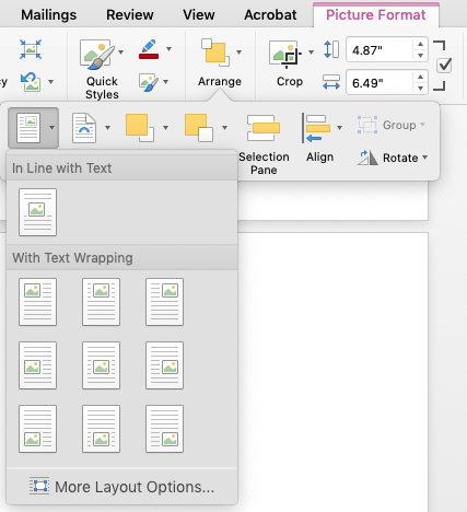
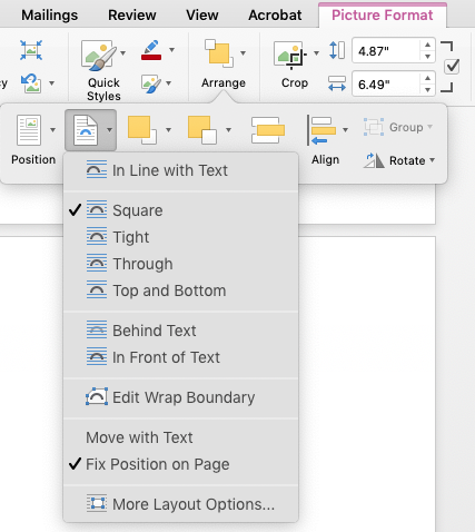
Most of the trouble you run into with these hybrid images revolve around placement options. Word gives you two sets of parameters for dealing with pictures/shapes in text: positioning and text wrap
Word’s positioning menu optionsWord’s text-wrap menu options
If a visual element has the positioning in line with text, then it behaves like a typed character—it can sit on a line with other characters, it moves around with other elements, etc. And I argue that this should be your goal for most or all visual elements you use in Word. You can set them on their own line, use other techniques to marry them to captions, center them, etc.
With all the other positioning options, the element is anchored to a spot on the page—a certain distance from a corner, for example. If you anchor the element, you use the wrapping options to tell Word how to wrap text around (or over, or under) the element. There may be legitimate reasons to do this, but Word is a rotten tool if that’s what you’re trying to do. I often see files where someone has placed an image with fixed positioning that they really just want inline with text—and then they insert a bunch of carriage returns to put the text down below it. This will break as soon as the text above gets a little longer or shorter.
Also, just for fun, if you set the wrap to “in line with text,” Word automatically does the same for the positioning, and vice-versa. This kind of makes sense, but can be confusing.
To simplify your life, treat each graphic as a standalone block, on its own line, flowing with the text.
This gets more complicated when you’re combining a picture with shapes. By default, the picture is placed “inline”. By default, a shape is positioned relative to something—positioning can be relative to the page, margin, paragraph, line, with separate options for horizontal and vertical position. Ain’t nobody got time for that.
So we’re back to inline positioning as the right way.
But with the Orientalist mysticism that you only find in cheesy action movies, when you’re dealing with a hybrid image like this, Word forces you to do things the wrong way before you can do them the right way. Here’s the trick: we need to manually position the picture and the shapes relative to each other. And Word doesn’t let you manually position elements that have inline positioning—again, it does make sense, but is confusing until you understand the principle.
First, make sure that all the visual elements have some kind of positioning that isn’t inline—it doesn’t really matter what.
Second, get all the shapes lined up correctly over the picture that acts as the backdrop. If some of the shapes are getting hidden behind the picture, select the picture and then execute Picture Format > Arrange > Send to Back.
Third, I like to group all the shape elements. This is probably unnecessary. Shift-click on all the elements in turn to select them and then execute Shape Format > Arrange > Group. The image below shows the shape elements grouped together, with a frame around them. You can still separately manipulate the elements in a group—it’s possible to move a grouped element unintentionally; if you need to move the group, you need to grab it by the group’s frame.
Grouped shapes in Word
Fourth, shift-click to select the grouped shape elements and the background picture, and group those.
Fifth, set the positioning of these grouped elements to “inline with text.” Phew! It’s faster to do than to read.
Not long after I took on my current role in AAR LLC, I inherited the task of producing the “binders” that the organization prints up every event cycle–basically, operations manuals for the event.
There was a fair amount of overlap between these binders, and I recognized that keeping that overlapping content in sync would become a problem. I studied documentation technologies and techniques, and learned that indeed, this is considered a Bad Thing, and that “single sourcing” is the solution–this would require that the binders be refactored into their constituent chapters, which could be edited individually, and compiled into complete documents on demand.
The standard technology for this is DITA, but that involves a lot of overhead. It would be hard for me to maintain by myself, and impossible to hand off to anyone else. What I’ve come up with instead is still a bit of a work in progress. It still has a bit of a tech hurdle to overcome–it does involve using the command line–but should be a lot more approachable.
The following may seem like a lot of work. It’s predicated on the idea that it will pay off by solving a few problems:
You are maintaining several big documents that have overlapping content
You want to be able to publish those documents in more than one format (web, print, ebook)
You want to be able to update your materials easily, quickly, and accurately.
The following is Mac-oriented because that’s what I know.
Installation
Install Homebrew
Homebrew is a “package manager” for MacOS. If you’ve never used the command-line shell before, or have never installed shell programs, this is your first step. Think of it as an App Store for shell programs. This makes installing and updating other shell apps much easier
Important: Don’t paste in shell commands you find on the Internet unless you know what you’re doing or you really trust me. But this is exactly what the nice folks at Homebrew will tell you to do.
Install Pandoc
Pandoc is a swiss-army knife tool for converting text documents from one form to another. In the Terminal app, paste in
brew install pandoc
Homebrew will chew on that for a while and finish.
Install GPP
GPP is a “generic preprocessor,” which means that it substitutes one thing for another in your files. In the Terminal app, paste in
brew install gpp
Again, Homebrew will chew on that for a while and finish.
Learning
Learn some shell commands
You’ll at least need to learn the cd and ls commands.
Markdown was created by John Gruber to be a lightweight markup language–a way to write human-readable text that can be converted to HTML, the language of web pages. If you don’t already know the rudiments of HTML, the key thing to remember about it is that it describes the structure of a document, not its appearance. So you don’t say “I want to this line to be in 18-pt Helvetica Bold,” you say “I want this line to be a top-level heading.” How it looks can be decided later.
Since then, others have taken that idea and run with it. The author of Pandoc, John MacFarlane, built Pandoc to understand an expanded Markdown syntax that adds a bunch of useful features, such as tables, definition lists, etc. The most basic elements of Markdown are really easy to learn; it has a few less-intuitive expressions, but even those are pretty easy to master, and there are cheat-sheets all over the Internet.
Markdown is plain text, which means you can write it in anything that lets you produce text, but if you do your writing in MS Word (aside: please don’t), you need to make sure to save as a .txt file, not a .doc or .docx file. There are a number of editors specifically designed for Markdown, that will show a pane of rendered text side-by-side with what you’re typing; there’s even a perfectly competent online editor called Dillinger that you can use.
I’ve gotten to the point where I do all my writing in Markdown, except when required to use some other format for my work. There are a lot of interesting writing apps that cater to it, writing is faster, files are more portable and smaller.
Organization
Refactor files and mark them up
Getting your files set up correctly is going to be more work than any other part of this. You’ll need to identify areas of overlap, break those out into standalone documents, decide on the best version of those (assuming they’re out of sync), and break up the rest of the monolithic documents into logical chunks as well. I refer to the broken-up documents as “component files.”
Give your files long, descriptive names. For redundancy, I also identify the parent documents in braces right in the filename, eg radio_channel_assignments_{leads}_{gate}.md. Using underscores instead of spaces makes things a little easier when working in the shell. Using md for the dot-extension lets some programs know that this is a Markdown file, but you could also use txt.
Then you’re going to mark these up in Markdown. If your files already have formatting in MS Word or equivalent, you’re going to lose all that, and you’ll need to make some editorial decisions about how you want to represent the old formatting (remember: structure, not appearance). Again, this will be a fair bit of work, but you’ll only need to do it once, and it will pay off.
Organize all these component files in a single directory. I call mine sources.
Create Variables
This is optional, but if you know that there are certain bits information that will change regularly, especially bits that appear repeatedly throughout your documents, save yourself the trouble of finding and replacing them. Instead, go through your component files and insert placeholders. Use nomenclature that will be obvious to anyone looking at it, like THE_YEAR or FLAVOR_OF_THE_MONTH. You don’t need to use all caps, but that does make the placeholders more obvious. You cannot use spaces, so use underscores, hyphens, or camelCasing.
Now, create a document called variables.txt. Its contents should be something like this:
And so on. Each of these lines is a command that GPP will interpret and will substitute the first term with the second. This lets you make all those predictable changes in one place. Save this in your sources directory.
You can get into stylistic problems if you begin a sentence with a placeholder that gets substituted with an uncapitalized replacement. There may be a good solution, but I haven’t figured it out. You should be able to write around this in your component docs.
Create BOMs
In order to rebuild your original monolithic documents from these pieces, you’ll want to create what I call a bill of materials (BOM) for each target document. This defines what the constituent component files are, and when you run GPP, the BOM tells GPP to assemble its output file from those component files.
I like to keep each BOM in a separate directory that’s at the same level as my sources directory (This gives me a separate directory to contain my output files.), so my directory tree looks like this:
My Project
     gate
        gate-bom.txt
     leads
        leads-bom.txt
     sources
        variables.txt
        radio_channel_assignments_{leads}_{gate}.md
        …
The contents of each BOM file will look something like this:
Because the BOM file is nested in a directory adjacent to the sources directory, you need to “surface” and then “dive down” into the adjacent directory. The leading ../ is what lets you surface, and the sources/ is what lets you dive down into a different directory.
Compilation & conversion
So you’ve got your files refactored and marked up, you’ve got your variables set up, you’ve got your BOMs laid out. Now you want to get back what you had before. Now it’s time for the command line.
Open the Terminal app, type cd followed by a space, drag the folder containing the BOM file you want to compile into the Terminal window (this will insert the correct path), and hit “return”. Use the ls command to confirm that the only file you can see is the BOM file you want to compile.
Now it’s time to run the following command:
gpp source-bom.txt -o source.md
This says “tell GPP to read in the file source-bom.txt, run all the commands in it, and create an output file based on it called source.md”. Make whatever filename substitutions are appropriate. The output file will be in the same directory as the BOM file. This will be a big Markdown file that is assembled from all the component files in the BOM, with all the variable substitutions performed.
Now that you have a Markdown file, the world is your oyster. Some content-management systems can interpret Markdown directly. WordPress requires the Jetpack plugin, but that’s easily installed. So depending on how you’ll be using that document, you may already be partly done.
If you want to convert it to straight HTML, or to an MS Word doc, or anything else, now it’s time to run Pandoc. Again, in the Terminal app, type this in:
pandoc source.md -s -o source.html
This says “tell Pandoc to read in the file source.md and create a standalone (-s) output file called source.html”. Pandoc will create HTML files lacking headers and footers if you leave out the -s. It figures out what kind of output file you want from the dot-extension, and can also produce MS Word files and a host of others. It uses its own template files as the basis for its output files, but you can create your own template files and direct Pandoc to use those instead.
I do my print documents in InDesign, and Pandoc can produce “icml” files that InDesign can flow into a template. Getting the styles set up in that template takes some trial and error, but again, once you’ve got it the way you like it, you don’t need to mess with it again.
Shortcomings and prospects
The one thing this approach lacks is any kind of version control. In my case, I create a directory for every year, and make a copy of the source directory and the rest inside the year directory. This doesn’t give me true version control–I rely on Time Machine for that–but it does let me keep major revisions separate. Presumably using Git for my sources would give me more granular version control.
Depending on what your output formats are going to be, placed images can be a bother. I haven’t really solved this one to my satisfaction yet. You may want to use a PDF-formatted image for the print edition and a PNG-formatted image for the web; Pandoc does let you set conditionals in your documents, but I haven’t played with that yet.
In fact, I haven’t really scratched the surface of everything that I could be doing with GPP and Pandoc, but what I’ve documented here gives me a lot of power. I’ve also recently learned of a different preprocessor called Panda, which subsumes GPP and can also turn specially formatted text into graphical diagrams using other shell programs, such as Graphviz. I’m interested in exploring that.
Over a century ago, King Gillette pioneered the razors and blades business model. The DMCA led to a new twist on this: companies have been trying to force you to buy their blades in particular by slapping microchips on them–even when those things don’t really have any need of a microchip–because that makes it illegal to reverse engineer.
This gave us the Keurig coffee machine, which has been successful, but has been deservedly criticized–even by its inventor–for its wastefulness. Keurig attempted to add DRM to their pods, although that backfired.
Catering to the herd mentality of the investor class (“It’ll be like Amazon, but for X!” “It’ll be like Facebook, but for X!” “It’ll be like Uber, but for X!”), this has led to…
Then the Teaforia, a $400 gadget (marked down from $1000) that makes tea from DRM-laden pods that cost $1 each or more. It flopped.
Now this thing, a spice dispenser that uses DRM-laden spice packets that cost about $5 a pop (spices obviously vary in prices, and it’s not clear how much comes in one of their packets, but I just bought 4 tbsp of cinnamon for $0.35).
These Keurig imitators represent an intersection of at least two bad trends: the Internet of Shit, where stuff that has no need of ensmartening is gratuitously connected to the Internet–a logical consequence of sticking unnecessary DRM-enabling chips on things, with those chips getting cheaper and more powerful–and the walled gardens of yore, like AOL–which companies like Facebook and Google have been attempting to reconstruct on top of the Internet ever since. So now we’ve got walled gardens of shit, filling up with their own waste products. Happily, the market seems to be rejecting these.
BetterTouchTool is one of my favorite Mac utilities. A real sleeper: originally it just let you create new trackpad gestures (or remap existing ones), and that was useful enough on its own, but it’s been beefed up with more and more interesting features. One feature I just discovered is that it can display a floating window with any HTML you want. This is a perfect way to show my Big Number Cheat Sheet, which is handy for checking your work when dealing with, well, big Japanese numbers.
To use this, open up BTT, add a new triggering event (can be triggered by a key command or text string, trackpad, whatever), and add the action Utility Actions > Show Floating Web View/HTML menu. Give it a name, set it to a width of 500, height of 750, and paste the following in directly. (Posting this online introduces a space between the opening < and !DOCTYPE — that should be deleted.) Be sure to enable “show window buttons” and/or “close when clicking outside” or the window won’t go away.


