From time to time, I’ve mused about modifications to the typical WIMP interface. I’ve previously written about an idea I called the sidepad. This is another take in the same spirit: a single-window interface.
Extreme interface nerdery within.
 in a new window")
Figure 1: a possible layout for a single-window interface (click for full-scale view in new window)
There have been a number of developments in Mac-land recently that attempt to deal with the problem of desktop clutter and distraction: word-processors that black everything out, or system utilities that black out everything except the frontmost application. I don’t have a big problem with distraction (well, maybe I do, but that’s a story for another day), but I do have a problem with clutter. I don’t like having every running app visible in the background—I usually hide apps that I don’t want to see—but I do want to see some stuff: the weather, what’s on my calendar, etc. I’ve found that if these aren’t part of my “passive environment,” I can overlook them. I’ve gone to some trouble to set up my desktop so that this kind of information is available in the background, but it still takes some effort to make the best use of my desktop real-estate. I’d like my desktop to be more disciplined.
Several high-end apps effectively put your computer into single-window mode: InDesign, Lightroom, and Aperture all take over almost the entire display. These are complicated, visually oriented programs, so it’s reasonable that they’d be designed both to minimize distractions and give the user as much working space as possible. Though with 20″ displays common, 24s readily available, and even 30s for those who can splash out on them, some people may not want to give over their entire screen to one app.
The major applications we mostly use tend to break down into a few categories: creating (word processors, drawing programs), reading/viewing (web browsers, newsreaders), and searching (file managers, media organizers like iTunes). Some applications don’t fall into one tidy category—e-mail involves a lot of both reading and writing, for example. These typically need to occupy a large fraction of the available screen in order to be useful, though some may be able to manage limited functionality through a reduced view (for example, iTunes’ miniature window).
Minor applications generally don’t need a lot of screen space to be useful. This category would include calculators, dictionaries, single-source newsreaders, etc. We used to call this sort of thing a “desk accessory”; these days they’re “widgets.”
The idea behind the single-window interface shown here is to keep as much information as possible at the user’s fingertips with some organization. This design would lend itself to a low-distraction view by fading out the secondary apps if desired.
In Figure 1, the center panel is the main app, with a column of secondary-app panels flanking it on each side. This is only one possible layout. Figures 2 and 3 show alternative layouts, and in fact, this idea relies heavily on the idea of workspaces, possibly with certain apps automatically invoking certain workspaces. Workspaces and layouts are not the same thing in this case: two workspaces could share the same layout, but each with a different battery of applications populating the various panes. It is likely, though, that each workspace would have its own layout, simply because both layouts and workspaces are ways to optimize the working environment centered around a certain task, and a given task would demand both a specific set of apps and a specific layout for them.
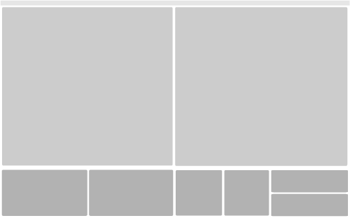
Figure 2: A layout with two primary panels for multitasking

Figure 3: A layout with a very large primary panel and fewer secondary panels, for focused work.
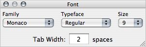
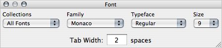
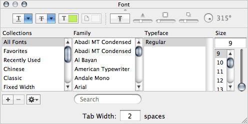
There would be some flexibility in the disposition of the secondary panels: adding a new panel would resize the others to fit. Also, in Figure 1, the main app’s palettes are corralled into a secondary panel. Not very artfully rendered here—in a real system, these palettes would fit their space better. In any case, as the palettes in their corral expanded or shrank, the surrounding secondary panels would likewise accommodate them. Because secondary panels can be of different sizes and proportions, the contents could not have fixed layouts. The elements would need to be prioritized and laid out according to rules, more like a web page. Apple has given a good example of how this can work with its Font panel, which shows more elements at larger sizes, and uses more space-efficient interface widgets at small sizes.
Note in the top-right corner of Figure 1 something that looks like the OS X dock. This is not intended to fill all the same functions as the dock—it is just an icon-parade of currently running “primary” apps (that is, apps that aren’t occupying a secondary panel). An icon-based launcher might be a reasonable addition, but that’s a separate function not addressed here.
The title bars of the secondary panels have a close icon to remove them from the current workspace (and most likely quit them), and a zoom button to shoot them into the primary panel. The title bar for the primary panel likewise has a close button and a shrink button. The shrink button could be used to either remove that app from the primary panel or demote it to a secondary panel.
This is just an idea, not likely to appear in any form any time soon, and hampered by my limited artistic skills. Still, I think that someday, the problem of disorganized desktops may eventually require a solution something like this. Clearly not everyone is bothered by a messy desktop, but features like Exposé are evidence of the problem we have not just finding stuff on our hard drives, but even finding stuff that’s running—and in extreme cases, even that won’t help.
this is a great idea. As a recent mac switcher, I’ve often found even using Photoshop to be annoying in that I can see my Firefox window behind the image I’m currently editing. I’d love to be able to have select applications be single window, but I think the idea of organized workspaces is great!
-r-