mac

Big-number cheat sheet and BetterTouchTool

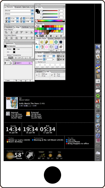
BetterTouchTool is one of my favorite Mac utilities. A real sleeper: originally it just let you create new trackpad gestures (or remap existing ones), and that was useful enough on its own, but it’s been beefed up with more and more interesting features. One feature I just discovered is that it can display a floating window with any HTML you want. This is a perfect way to show my Big Number Cheat Sheet, which is handy for checking your work when dealing with, well, big Japanese numbers.

To use this, open up BTT, add a new triggering event (can be triggered by a key command or text string, trackpad, whatever), and add the action Utility Actions > Show Floating Web View/HTML menu. Give it a name, set it to a width of 500, height of 750, and paste the following in directly. (Posting this online introduces a space between the opening < and !DOCTYPE — that should be deleted.) Be sure to enable “show window buttons” and/or “close when clicking outside” or the window won’t go away.

< !DOCTYPE html>
<html>
<head>
    <meta charset="utf-8" />
    <title> </title>
    <style> 
        body {
        background-color: #fff;
        font-family: helvetica;
        font-size: 14/18;
        }
        table {
        border-collapse: collapse;
        }
        tr, td, th {
        border: none;
        }
        tr {
        border-bottom: 1px solid #ddd;
        }
        table tr td:nth-child(1), table tr th:nth-child(1) {
        width: 7em;
        padding: 0.5em;
        text-align: right;
        }
        table tr td:nth-child(2), table tr th:nth-child(2) {
        width: 12em;
        padding: 0.5em;
        text-align: left;
        }
        table tr td:nth-child(3), table tr th:nth-child(3) {
        padding: 0.5em;
        text-align: left;
        }
        tr:hover {
        color: #ddd;
        background-color: #333;
        }
    </style>
</head>
<body>
<h1>
    Big number cheatsheet 
</h1>
<table>
    <tr>
        <th> 和 </th>
        <th> English </th>
        <th> Number </th>
    </tr>
    <tr>
        <td> 一万 </td>
        <td> ten thousand </td>
        <td> 10,000 </td>
    </tr>
    <tr>
        <td> 十万 </td>
        <td> one hundred thousand </td>
        <td> 100,000 </td>
    </tr>
    <tr>
        <td> 百万 </td>
        <td> one million </td>
        <td> 1,000,000 </td>
    </tr>
    <tr>
        <td> 千万 </td>
        <td> ten million </td>
        <td> 10,000,000 </td>
    </tr>
    <tr>
        <td> 一億 </td>
        <td> one hundred million </td>
        <td> 100,000,000 </td>
    </tr>
    <tr>
        <td> 十億 </td>
        <td> one billion </td>
        <td> 1,000,000,000 </td>
    </tr>
    <tr>
        <td> 百億 </td>
        <td> ten billion </td>
        <td> 10,000,000,000 </td>
    </tr>
    <tr>
        <td> 千億 </td>
        <td> one hundred billion </td>
        <td> 100,000,000,000 </td>
    </tr>
    <tr>
        <td> 一兆 </td>
        <td> one trillion </td>
        <td> 1,000,000,000,000 </td>
    </tr>
    <tr>
        <td> 十兆 </td>
        <td> ten trillion </td>
        <td> 10,000,000,000,000 </td>
    </tr>
    <tr>
        <td> 百兆 </td>
        <td> one hundred trillion </td>
        <td> 100,000,000,000,000 </td>
    </tr>
    <tr>
        <td> 千兆 </td>
        <td> one quadrillion </td>
        <td> 1,000,000,000,000,000 </td>
    </tr>
    <tr>
        <td> 一京 </td>
        <td> ten quadrillion </td>
        <td> 10,000,000,000,000,000 </td>
    </tr>
</table>
</body>
</html>

Time Machine to NAS: Not quite there

I recently upgraded my Mac to Leopard, whose marquee feature is Time Machine, a nice backup mechanism.

I already had a NAS box. I originally got this primarily as a backup target. It’s got a half-terabyte hard drive in it, and it supports AFP, so it seems like a logical target for Time Machine backups. And apparently in the betas of Leopard, it was possible to use a hard drive attached to an Airport Extreme as a Time Machine target. This was disabled in the shipping version, but there’s a simple hack to re-enable it. Which I applied: as it happens, this made also it possible to use Time Machine with my NAS box.

One critical difference between my NAS box and a hard drive hanging off an Airport Express is the disk format. Time Machine requires an HFS+ disk. My box is using something else. Time Machine actually deals with this cleverly by creating a disk-image file on the target drive, but that’s also the root of the problem: Mounting this disk image over the network (even GigE) gets slower and slower as the file gets bigger and bigger. I had set up a very stripped-down backup profile (home directory only, no media files), but still, after a couple of weeks, it had gotten to 42 GB and took forever to mount. Eventually it took so long to mount that Time Machine would stop waiting for it and give up.

So until I get a Time Capsule or something, I’m using my previous backup app, Synk. Even after, it might be worth it to use Synk to back up my media files, which don’t need quite the obsessive hourly backup that Time Machine offers.

MacBook Air reaction

The interesting thing about the MBA (heh) is that it is intended as an “outrigger” computer. While it could be barely self-sufficient, the idea seems to be that anyone owning one would have a bigger computer somewhere else. That’s a reasonable assumption and the outrigger market is a reasonable one to serve. But if that was Apple’s starting point, they’ve made some weird choices.

  • Price: $1800 is a big commitment for a secondary computer.
  • Size: It’s small, but it’s not that small; its footprint is big enough that it clearly bothers a lot of people. And for that matter, it seems that they could have shaved an inch off the width and half-inch off the depth without cutting into screen or keyboard.
  • Power: It’s not exactly high-spec, but it’s pretty high-spec.

There is an emerging trend of cheap and cheerful devices that aren’t practical as fully functioning standalone computers, but are fine for web-surfing, media playback, and lightweight work. Things like the Nokia N810 or the Asus Eee. Apple seems to be borrowing the outrigger aspect of these devices without picking up on their other features—low-power CPU, small screen, limited keyboard, etc—features that make them less than workhorses, but easier to schlepp around and longer running. The MBA is a more or less full-power serious work machine and fashion statement that isn’t quite self-sufficient but doesn’t quite embrace its second-computer status either.

It’s been widely speculated that Apple would, eventually, introduce something that would fit somewhere between a laptop and the iPhone. Like a tablet. It may be that the iPhone is Apple’s tablet, but the choices behind the MBA leave room at the low end of the market for something else. Some people are already filling that void by installing OS X on the Asus Eee. I don’t think the MBA is going to be it for a lot of people.

Leopard initial reactions

Rather than buying a new computer, I’m updating my old one right now, and installed Leopard yesterday.

Normally when I install a major upgrade, I do a “clean install”—reconstructing my old environment by manually importing old files and recreating preferenecs is admittedly laborious, but it gives me a chance to re-examine what’s on my hard drive and jettison stuff I never use. I cloned my boot drive to an external drive, and selected the erase-and-install option in the Leopard installer. After that finished, it offered to import my old setup from my external drive. For some reason, I chose this option, and regretted it, as it faithfully imported every bit of cruft from my old system, some of which caused Leopard to lock up. Apart from that, I have to admit it did a sterling job—every jot and tittle was in place. It would be nice if I had more control over what got imported and what did not.

Tried again with the clean install, followed by manual copying of specific folders and files. I had a little trouble importing my old Mail folders, and discovered that I had to export my Address Book data (using Address Book running on a different computer) before I could import it to Leopard. And then I discovered one of those annoyances only a geek could love. For whatever reason, my short user name was now adamjrice. It has always been adamrice in the past, and this change was, of course, unacceptable. The path to my $HOME directory had changed similarly. One new and appreciated feature in Leopard is that it’s actually easy to change this: right-click on your username in the Accounts prefpane sidebar and it gives you the “advanced options” to fix this. Nice. However, it makes this change by creating a new $HOME directory with defaults, not by moving the old one, and instantly, silently migrating you to that. This causes weird and unwanted results. My advice: if you are going the clean-install route, check to make sure you are happy with your short user name before you do any customization. Fix it if need be, and log out/relog.

Other than these breaking-in pains, so far I’m happy. My computer is noticeably faster (not just subjectively—apps open faster, and Second Life, a poky pig, ran at about 2x the framerate making it almost tolerable), although this may have as much to do with blowing out some crufty haxies as anything else. Network throughput likewise seems to be faster, but I haven’t measured this.

QuickLook is probably worth the price of admission all by itself, especially if you can get plugins for the files you use the most. Last night, Gwen was trawling through a directory full of EPSs with meaningless names. Even though she’s still running Tiger, I mounted her drive, installed a QuickLook plugin for EPS, and was able to browse most (not all) of those files with previews in a couple of minutes. Big win. Coverflow in Finder, which seems like a frill, is useful in the same way QuickLook is, especially when, say, trawling through a directory full of meaninglessly-named EPS files.

As others have mentioned, Spotlight has gone from sucking to not-sucking. I reiterate that fact simply because the transformation is so stark.

So far, I’m calling this a success.

.Mac—a missed opportunity

A post on oreillynet got me thinking about .Mac, Apple’s online thingy for mac users. Apple recently updated it, and while the updates are nice enough, I think Apple is missing an opportunity.

I don’t know how many people use .Mac. I get the impression that not many do. It seems overpriced for what you get. So what do you get? An e-mail address and web mail. Online photo galleries and web pages. Remote backup, storage and (for some apps) syncing. Apple just increased the available storage from one gig to ten, and added some other features—”groups” (sort of like Yahoo Groups or Google Groups), domain-name hosting, and upgrades to the existing features (the photo album is pretty slick).

All this for the not-very-low cost of $100/yr. Apple is competing with two other alternatives here: free and generic.

There are free groups, free photo hosts, free mail services, free blog hosts, and so on. Of course, these are all ad-supported. And they’re good: Gmail’s webmail is considered by some to be the best mail client out there—web-based or local. It’s hard to compete with free, especially when it’s as good as it is. Admittedly, a lot of people get a little creeped out by having their data mined by Google, and putting their entire digital lives in Google’s hands.

On the generic side, for the price of a .Mac subscription or less, you can get a web-hosting account that gives you access to a Unix shell, more storage space (at Dreamhost, which notoriously oversells, I’m getting something like 250 GB of storage, of which I barely use 1%), web-based management tools, and access to the whole panoply of web-side apps, like WordPress, Drupal, Gallery, and so on. So it is possible to duplicate most or all of what .Mac does using open-source software that gives you more control and potentially broader functionality. Not everyone wants that level of control or needs all those features, but there are a lot of WordPress and Movable Type blogs out there, a lot of bulletin-boards and community sites, and so on. Clearly it’s not a small market, and I’d bet it’s a lot bigger than .Mac.

So, given that .Mac is not free and does not offer the same level of functionality as the other options, what does it offer? I see two things: All the templates for information hosted on .Mac look great (although the underlying HTML can be scary), and it has good integration with the client. Pretty much what you’d expect from Apple.

.Mac has been around in some form since the Internet first caught fire, and at that time, the kinds of things that regular folks would want to do online were not well-established. .Mac (originally “iTools”) was speculative in that sense. Some things, like photo galleries, turned out to be correct. (Although even there, flickr has shown us how photographs can be the nexus for communities, in a way .Mac can’t approximate.) Others, like remote backup, haven’t really panned out yet because A) the service doesn’t offer a meaningful amount of storage, and B) most of us don’t have a sufficiently fast upstream connection to make it practical. .Mac has changed and expanded its services, but hasn’t always kept pace with trends in Internet usage.

The recent updates to .Mac seem nice, but do not tempt me. What would tempt me would be if Apple offered the same slick client-side integration, but tied into a more generic hosting service—one where I can install a WordPress blog or a Drupal CMS.

Go with the workflow

In “A Feature Request for Apple Mail”, Jochen Wolters talks about introducing workflows into Mail.app. I think this is an interesting idea, but it doesn’t go far enough. Mail may be the app where many of us organize most of our administrivia, but it isn’t the only one. Apple should give better exposure to the excellent metadata system it created for OS X 10.4, and make projects and workflows canned datatypes in it. Apple is already taking baby steps in this direction with the to-do service built into the future version of Mail

How would this work?

Let’s take a typical translation job for me. It may involve four or five e-mail messages, a couple PDFs, and a couple of Word documents; if I wanted to get really organized, I’d add an item to my calendar showing the deadline. These are all disparate types of data managed through different applications, but they’re all related. Every job goes through a few stages (some of which are often skipped): inquired, estimated, accepted, underway, completed, invoiced, paid. Different activities may have different workflows (I’d need a completely different workflow for my fire-equipment business). So I need to A) define general types of projects and the steps of a workflow associated with each one; B) conveniently set up new projects and indicate their project types to pipeline them into a specific workflow; C) conveniently associate messages, files, etc, with a project; D) view and change the state for each workflow. It needs to be dead-easy: the marginal effort to assign a message to a project rather than just skip to the next message needs to be vanishingly small. I imagine hitting a magic key that pops up a list of active projects to choose from (with the option to create a new one); if any text is selected, a new project is created with that text as the title.

Mail Tags permits something like this, after a fashion, but only within the world of Mail.app. This might be enough if you’re content to use mail as a PIM, but I’m not (and it would get ugly trying to deal with files, and Mail Tags does not currently work with IMAP as described in that article). What I’m describing would need to be a system-level feature that was exposed in mail messages, setfile dialog boxes, the Finder, etc.

Projects could be viewed through the Finder, like smart folders. The viewing window for mail messages could include a banner showing a menu of pending projects to select from; once a message was assigned to a project, a row of buttons would be used to show and change state (this could also appear in the Finder window for the project).

Update: After doing a little more noodling on this, I’ve come up with the following bezel displays

workflow bezels

The three would not all appear at once. I envision that for an unassigned file, the magic key would bring up the first; if the user selects “New Project…” it transitions to the second; pressing the space bar would flip it to the third. For a file that has been assigned to a project already, it would go directly to the third. Those aspects of the workflow setup that couldn’t be controlled through this interface would probably be handled through a preference pane. The bezel would act on whatever document window is foremost.

At a basic level, there’s almost nothing in the data model for this that couldn’t be handled through OS X’s existing metadata constructs; the one thing that could not be would be a table associating project with project type/workflow. And so there’s no reason a third-party developer couldn’t do this right now. At a more advanced level, ideally there would be hooks added that would tie project-related events to other events, for example, when the mail client is foremost, setting a project on a message might close that message and move to the next. In MS Word, saving a file with no project would bring up the project-assignment bezel.

In fact, there’s already a program, SpotMeta, that lets users create enumerated types of metadata and apply them to files. As clever as it is, it’s a little clunky to use, and doesn’t have a straightforward way of working with mail messages, iCal events, etc (though technically, it could work with them).

Dealing with items that have been tagged with a project and workflow state could mostly be handled through smart folders in the Finder, in Mail, etc. Ideally there would be some kind of universal viewer (most likely hacked onto the Finder) that could show the contents of all the various datatypes corralled into a workflow.

Ambient notifications in Mail

A blog entry at O’Reilly discusses how the author has set up Mail to notify him of incoming messages. I do something similar, using a more layered approach, so in the interest of meticulously documenting everything you can do with Mail, as well as exploring ideas for ambient notification in mind-numbing detail, here goes.

When the topic of using OS X comes up, I tell people that if you drink Apple’s kool-aid and use its apps religiously—Mail, Address Book, iCal, iPhoto—then it will pay off for you. Since they hook into each other, and other apps hook into them as well, you really do get synergistic benefits. For example: if you keep all your contacts in Address Book, you can filter your mail in useful ways. If you create groups in Address Book to categorize your contacts, mail filters can be more useful.

I filter my mail based on whether the sender is in my clients group or my friends group; each goes to its own mailbox, and other actions are triggered as well.

When I receive messages from friends, their names are spoken aloud to me using this script.

When I receive messages from clients, the “work bell” rings (this is something Mail can do on its own), and a Growl notification appears on-screen using this script. I’d like to make it so that clicking on the notification blob opens the message in question, but I haven’t figured that part out yet. These notification blobs are actually pretty intrusive (they sit there until you click on them to dismiss them), but this was an intentional decision: if it’s work-related, I probably want to be interrupted.

When I receive messages from people I’ve never corresponded with before, it’s very likely those messages are spam. So I filter messages where the sender is not on my previous recipients list (this is a handy, and I suspect little-known feature in Mail) to a “holding pen” mailbox that is essentially a waiting room for my junk box. This makes it a little easier to prioritize and batch-process mail in the eternal struggle for inbox zero.

Recently, I discovered DockStar–this lets me see how many messages are in each of several boxes. This alone would almost be enough, but I like the extra channels of information I get.

The trouble with Mail

I’ve recently started reading Hawk Wings, a blog focused mostly on Apple’s Mail.app and other personal-information programs like iCal and Address Book. I’m always keen on ways to tweak Mail, but I was moved to actually write about it by the recent post Mail’s most annoying bug. It got me thinking about all the ways Mail could be better.

When it was released with OS X 10.0, Mail was barely usable. I had used Eudora up to that point, but when I made the switch to X, I decided to leave the old OS behind completely. While Eudora was available, it did not handle Japanese; it only handled Japanese on OS 9 thanks to a plugin that had not been ported to X (I know nothing of the state of Eudora’s i18n today). I looked at some third-party alternatives, and gladly would have paid for one that I liked, but I found nothing that I liked better than Mail, so I stuck with that.

Today, Mail is a pretty good program, but it has obvious problems, and even if those were all fixed, would be solid but not innovative.

Bad/no keyboard equivalents: Mail lets you read messages one of two ways: by splitting the window into a message-list pane and a message-viewing pane, or by showing each message in its own window. My natural inclination (probably inherited from Eudora) is to open each message in its own window, but when you do this, it is impossible to use the keyboard to navigate between messages while viewing the message. You need to close the current message window, then arrow up/down, then open that message. It’s a small thing, but multiplied out hundreds of times a day it adds up. I am dumbfounded by the lack of this, as well as some of the strange keyboard commands that are there—the commands to send and check mail, two of the most common e-mail activities, are obscure and non-mnemonic.

Bad threading: Mail tries to group messages by thread, but also groups based on subject line. I have a client that uses the subject line “request” on every message he sends me, so every time he sends me work, I need to disclose an increasingly ungainly list of messages (I keep all the old ones around just because I am that way). Another weakness in this quasi-threading is that it is “flat”–it doesn’t show which message is replying to which. This is possible. Properly threaded e-mail been possible for decades. Apple should be able to figure it out.

Inclusion of .sig in body: As far as I can tell, most civilized mail clients segregate the signature line from the body of the message when you are editing. Not Mail. This means you needs to edit around the .sig, or add it back after you’ve deleted it.

Reply format oriented towards top-posters: I’m not going to say that top-posting is wicked and only evil, stupid people do it, but I don’t do it. [Update: Holy crap, look at the passions this topic arouses.] When replying to an e-mail, I try to interleave my points with the sender’s points. Mail is set up to encourage top-posting though: it places the cursor on a blank line above the quoted text, and prefaces the quoted text not with a salutation but with a more bureaucratic “on such-and-such a date, so-and-so wrote:”. So there’s that wasted blank line, and a first line that I almost invariably wind up editing (if you get e-mail from me that has that introductory line unedited, it means either that I’m really busy, that you are bugging me, or that I don’t know how to address you). Again, customized salutation lines have been around for a very long time. Mail should solve this and not assume that everyone is a top-poster. And when I want to interleave my response into the quoted text, Mail does a lazy job. The helpful thing would be to create three blank, unquoted lines with the cursor on the middle line. Mail creates one blank unquoted line. If I’m inserting a comment between two paragraphs of quoted text, there will be one blank quoted line just hanging there—it should clean that up. I think Eudora did.

Simple filtering: I use a lot of rules in Mail to direct my mail into the appropriate slots. I know that Boolean logic can get confusing, but Mail could offer an expert mode for creating rules like “If (A or B) not C” Yes, I know that Mailsmith can do this. I also know that Mailsmith has no support for Japanese. i18n is a real bright spot in Mail: before Mail, e-mail containing Japanese was a frequent PITA. I still have occasional problems with it, but the problem is mostly solved.

No queue for outgoing mail: This is another one of those Eudora features I miss. With Eudora, it was possible to write a message and queue it for delivery later (indeed, this was the default, though it was also possible to send immediately). Not with Mail: you send it, it’s gone. A five-minute grace period would save a lot of mistakes.

So far, these complaints are just of the “this is broken” variety. There are lots of ways Mail could actually be innovative.

Presentation of threads: This is one thing where gmail is out in front: it shows “conversations,” including both messages you received and sent as part of the conversation. Even if Mail would show all the messages in a mailing-list thread in one window—ideally with proper threading indicated—I’d be very happy. If it could go a step further and strip off all the detritus of footers and excess quoting, I’d be amazed.

Mailing-list handling: As long as we’re talking about mailing lists, Mail should be smart enough to recognize “hey, you’ve subscribed to a mailing list” and offer to set up special mailboxes and filters for it. Since almost all mailing lists run on a handful of platforms (Yahoo Groups, Google Groups, Mailman, and maybe one or two others), it should be possible to create special actions for quitting a list, etc, so that newbies who subscribe to a list they then decide to leave don’t post annoyed and annoying messages to the list asking “how do I leave this list?” (actually, this suggests a whole xmlrpc mechanism for managing lists, but that’s a topic for another day).

Ad-hoc mailing lists: this could be dangerous in the wrong hands, but sometimes it is useful to have a mailing list for a short period of time and a small number of people. With the right rules and actions, a mail client could emulate a mailing list well enough. There should be a quick way to set this up.

Alternate views: It could be useful (or at least interesting) to be able to view my mail database in calendrical form. Or by person. It would be interesting, for example, to see a histogram of all the mail exchanged between me and Gwen over time.

The Sidepad

I’ve been musing a bit lately about the problem of having too much information on our computer screens to deal with. I’ve also been thinking about the problems involved in using a computer as the hub of an entertainment center. What follows is a concept that might be able to address both problems, as well as a few others.

This is a gadget I call the “sidepad.” It has a few modes of operation.

1. Docked mode

In this mode, the sidepad is physically connected (via a docking station) to the host computer, and acts as a specialized secondary display.

I’ve written before that I like the idea of roping off a section of my display for to use as for status-monitoring displays and the like, or better yet, a separate display entirely. There wouldn’t be enough of this ancillary stuff to fill a normal display (even a small one), but a custom display such as I am proposing would be perfect.

Shown here is a very rough mockup of a 20“ iMac with an ancillary display showing how the two would relate.

Image showing iMac with sidepad

Here is a detail of just the sidepad in docked mode

Detailed view of sidepad in docked mode

In this, the ancillary display shows the dock, application palettes, and ”dashboard“-style information, though in a much simpler and more disciplined format than Apple’s Dashboard. For lack of a better name, I’ll tentatively call this part of the display the ”dashpad“. Rather than having each widget being free-floating and self-contained, each dashpad widget fits into a ”slot“ and has no chrome (though actual widgets in this case could be somewhat dressier than I am showing them here). I have left the application palettes alone, although I envision a standard visual format for them, along with a special API to take advantage of the ancillary display.

How would something like this work technically? At the physical level, I imagine a dock that would connect to the host via Firewire. Although it would act in some respects as a second display, it would probably need to be treated more as a peripheral; it would have its own processor, which would need to collaborate with the host to fake acting like a second display in some respects.

At the software level, the OS would need a new API that let applications relegate palette display to the sidepad when present, along with support in the OS for the look and actions of those palettes. Likewise display of the dashpad.

2. Detached mode

In this mode, the sidepad is undocked from the host computer, but within wifi range, and acts as a remote terminal for that computer, as well as the command center for home entertainment.

We’re at a point where having a remote display for one’s home computer can be incredibly handy. Such as:

  • You see something while watching TV and want to check some background info on the web (IMDB entry on an actor, product website for something you see advertised).
  • You are piping music from your computer to your stereo. You want to be able to see track info, and to have more control over playback than next/previous track buttons on a normal remote offer.

Obviously these tasks can be accomplished with another computer networked into your primary computer, but this can require a fair amount of setup, and the expense and maintenance of an another computer. Apple likes to talk about its computers being ”digital hubs,“ and I love the idea, but I need to be able to use it out at the ends of the spokes.

Shown here is the sidepad removed from the dock. It would communicate with the host over wifi (probably setting up a VPN). Assuming the mac was also hooked up to, say, a TV and stereo, the sidepad would work as a remote control in this mode, directing media signals to the appropriate outputs.

sidepad in detached mode

In this mode, the screen would show something completely different. A fixed source browser would appear on the top-left, with tabs for one’s computer, the Internet (which would show a browser in the remainder of the screen), music, movies, photos (which would hook into the appropriate sources on the host’s hard drive, and display suitable browsers), and an organizer (contacts and calendar that would sync with the appropriate iApps).

3. Outbound mode

In this mode, the sidepad is operating independently of the host computer, functioning as an Internet terminal, media player, and PDA.

A lot of people who mostly need a desktop computer could also use something lightweight for e-mail, web surfing, and entertainment when they are away from home. The proportions of the display are not an accident: it has a 16×10 aspect ratio, for widescreen video. A laptop (especially a used one) is not an unreasonable solution, but may be overkill, and requires more work (and if Apple has its way, a .Mac subscription) to keep in sync with one’s desktop. Low-powered, small, and lightweight web-surfing tablets such as the Nokia 770 and Pepperpad already exist, but these are not really designed to sync with larger computers, much less provide either of the other modes I’ve discussed.

In order to fulfill its other functions, the sidepad would need a powerful enough processor to act as a PDA, with utility applications like a word processor, spreadsheet, and e-book reader. So it would be a no-brainer to include these functions in this mode.

One aspect of this mode that is open to criticism is the fact that it would require a fair amount of storage to be useful, increasing its price and putting it dangerously close to iPod territory. This could be handled by making storage optional, by using a memory-card slot, or by actually designing in an iPod dock.

The display in this mode would be very similar to that in Detached mode. The functionality would be different, though. The ”my computer“ tab might be disabled if a VPN at a decent speed cannot be established. The media tabs would reveal locally stored content, not content on the host computer.

Objections

What are the odds of something like this being built? Slim. There are a lot of problems with this idea:

  • Price: it might wind up being expensive enough that most people would reasonably ask ”why not just get a laptop?“
  • Size: For one thing, the size is not one we’ve seen before in a portable product—bigger than a PDA, PMP, or portable game console, but smaller than a laptop. The fact that nobody’s selling a device this size (measuring roughly 12” x 6“, the size of a license plate in North America) may be because nobody would buy it. For another thing, in order to feel well-connected to the host machine in docked mode might require different models for different screen sizes.
  • Marketing: With several different modes, none of which are ones that most consumers will instantly grok, this would be a challenge to sell effectively.

Still, I’d buy one.