Promoting parental responsibility
Bumper sticker spotted at El Chilito:
“If you don’t talk to your kids about John Aielli, who will?”

Bumper sticker spotted at El Chilito:
“If you don’t talk to your kids about John Aielli, who will?”
 iTunes is overloaded.
iTunes first came out in 2001. At the time, you could use it to rip CDs, burn CDs, play ripped files, and organize those files. You could also use it to copy files to an MP3 player (the iPod didn’t exist at that time).
The personal computing landscape has changed a lot since then, and so has iTunes. It’s being called on to do a lot more.
I’ve said before that the Mac works best when you “drink Apple’s kool-aid,” that is, organize your contacts in Apple’s address book, your appointments in iCal, etc, because these apps act as a front-end to databases that other apps can easily tap into. The same goes for iTunes: Apple nudges you into using it to organize not only your music, but also your video files, and the iTunes database becomes almost like a parallel file system for media files. iPhoto is the manager for, well, photos.
When I first got an iPod a couple years ago, it seemed a bit odd that I could sync my contacts and calendars to it—through iTunes. While it makes sense to manage one’s iPod through iTunes, there was already a subliminal itch of cognitive dissonance.
With the iPhone, that cognitive dissonance is breaking out into a visible rash. The media types that it manages now includes applications for the iPhone. iPhoto is the mechanism for selecting photos to copy to the iPhone, and either it or Image Capture is used to download photos taken with the iPhone’s camera. Curiously, there’s no way to get photos off the iPhone within iTunes; this feels like an oversight, or perhaps someone in Apple was feeling a bit of that itch as well, and felt unwilling to load up iTunes with another function even further from its central purpose.
While I’m not aware of any yet, at some point there will be apps from independent developers that need to exchange files between the desktop and the iPhone other than those handled by iTunes—it’s easy to imagine word-processing files, PDFs, presentation decks, etc, being copied back and forth. It’s not clear how that will happen. It could all happen via the Internet, although that would be indirect both physically and in terms of the user’s experience. For large files, it would be annoying, and for people without unlimited-data plans, potentially expensive. Apple does offer programmers a bundle of functions called “sync services,” but this requires the desktop application be written to support syncing in the first place. For a lot of the file transfers I envision, syncing wouldn’t be the appropriate mechanism. There’s not even a way to get plain text files from Apple’s own Notes app off the iPhone. It’s widely speculated that cut and paste are absent from the iPhone because Apple hasn’t figured out a good interface for it. I suspect it’s the same thing here: they haven’t figured out a good, general mechanism for moving files between iPhone and desktop.
At some point, Apple is going to have to re-think the division of labor in its marquee apps, to separate organizing files from manipulating or playing them.
I don’t expect to do a lot of Japanese text entry on my iPhone, but I’m glad that I have the option, and I’ve been enjoying playing around with that feature.
Any Japanese text-entry function is necessarily more complex than an English one. In English, we pretty much have a one-to-one mapping between the key struck and the letter produced. Occasionally we need to insert åçcéñted characters, but the additional work is minimal. In Japanese, the most common method of input on computers is to type phonetically on a QWERTY keyboard, which produces syllabic characters (hiragana) on-screen—type k-u to get the kana ã, which is pronounced ku; after you’ve typed in a phrase or sentence, you hit the “convert” key (normally the space bar), and software guesses what kanji you might want to use, based on straight dictionary equivalents, your historical input, and some grammar parsing. So for the Japanese for “International,” you would type k-o-k-u-s-a-i; initially this would appear on-screen as ã“ãã•ã„, and then after hitting the convert key, you would see 国際 as an option. Now, that’s not the only word in Japanese with that pronunciation—the word for “government bond” sounds exactly the same and would be typed the same on a keyboard. To access that, you’d go through the same process, and after 国際 appeared on-screen, you’d hit the convert key again to get its next guess, which would be 国債, the correct pair of kanji. Sometimes there will be more candidates, in which case a floating menu will appear on-screen.
The first exposure most English speakers have had to the problem of producing more characters than your input device has keys has come with cellphones. T9 input on keypad is a good analogue to Japanese input on QWERTY: you type keys that each represent three letters, and when you hit the space key, T9 looks up the words you might have meant, showing a floating menu.
The iPhone, of course, uses a virtual QWERTY keyboard for English input, which is pretty good, especially considering the lack of tactile feedback and tiny keys. It guesses what word you might be trying to type based on adjacent keys. It does not (as far as I can tell) give multiple options, and isn’t very aggressive about suggesting finished words based on incomplete words. For English, at least, I’m guessing Apple decided that multiple candidates for a given input are too confusing. In general, the trend for heavy English text input on mobile devices seems to be towards small QWERTY keyboards, despite the facility some people have with T9. I’m wondering how many people are put off by the multiple-candidate aspect of T9, and if that’s why Apple omitted that aspect, or if it’s simply that not enough English-speakers are accustomed to dealing with multiple candidates.
Japanese input on the iPhone is different. It is aggressive about suggesting complete words and phrases. It does show multiple options (which is necessary in Japanese, and which Japanese users are accustomed to). In fact, it suggests kanji-converted phrases based on incomplete, incorrect kana input. Here’s an example based on the above:
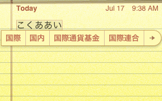
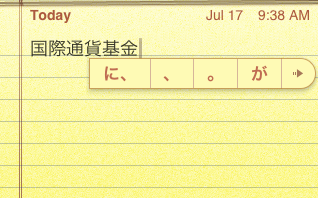
Here, I typed k-o-k-u-a-a-i (note the intentional typo), which appears as ã“ãã‚ã‚ã„. It shows a bunch of candidates, including the corrected and converted 国際, a logical alternative 国内, and some much longer ones, like 国際通貨基金—the International Monetary Fund. Since it has more candidates than it has room to display, it shows a little → which takes you to an expanded candidates screen. Just for grins, I will accept 国際通貨基金 as my preferred candidate. Here’s another neat predictive trick: immediately after I select that candidate, it shows sentence-particle candidates like ã« ãŒ, etc.
Let’s follow that arrow and see what other options it shows:
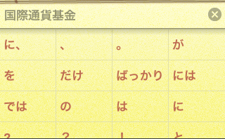
I’m going to select ã‚’ as my candidate. It immediately shows some verbs as candidates:

Here, å‚ã‚Šã¾ã™ is a verb I used previously, but 見 and 食㹠are just common verbs—I’m guessing they’ve been weighted by the input function as likely for use in text messages (the phrase 国際通貨基金を食㹠is somewhat unlikely in real life, unless you are Godzilla).
The iPhone also has an interesting kana-input mode, which uses an ã‚ã‹ã•ãŸãª grid with pie menus under each letter for the rest of the vowel-row. It looks like this:
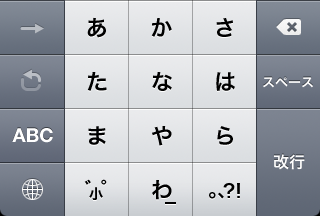
To enter an -a character, just tap it:

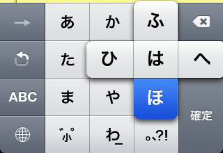
To enter a character from a different vowel-line, slide your finger in the appropriate direction on the pie-menu that appears and release:
You can also get at characters from a different vowel-line using that hooked arrow, which iterates through them. I haven’t figured out what that forward arrow is for. It’s usually disabled, and only enabled momentarily after tapping in a new character. Tapping it doesn’t seem to have any effect.
This method offers the same error-forgiveness and predictive power as Japanese via QWERTY. I don’t find it to be faster than QWERTY though, but perhaps that’s just because I’m not used to it.
One thing I haven’t found is a way to edit the text-expansion dictionary directly. This would be very handy. I’m sure there are a few more tricks in store.
Also, a fun trick you can use on your Mac well as on an iPhone to get at special symbols: enter ゆー゠to get €. Same with ã½ã‚“ã©ã€ã‚„ã˜ã‚‹ã—ã€ã‚†ã†ã³ã‚“, etc.
Update Apparently the mysterious forward-arrow breaks you out of iterating through the options under one key, as explained here. Normally if you press ã‚ ã‚, this would iterate through that vowel-line, and produce ã„. But if you actually want to produce ã‚ã‚, you would type ã‚→゠(Thanks, Manako).
The day after the iPhone 3G was released, I got one. So did Gwen. It’s very nice. I feel like I’ve entered the future. It’s not fair to compare it to any other cellphone I’ve ever used—the difference is almost as stark as the one between the Mac I’m typing this on and a vintage 1983 DOS computer. I played with a friend’s Palm phone recently, and that was perhaps on the order of Windows 3.1 by comparison. Others have spilled gallons of electrons writing about this thing, so I’ll just offer a few random observations.
Out of the box, it is the source of enough wonder and delight to keep you going for quite a while, but the big deal now is that there’s an official path for independent developers to put software on it, which multiplies its value. The fact that these apps will be able to tie into location data, the camera, the web, etc, suggests any number of interesting possibilities. More than any other gadget I’ve played with in a long time, the iPhone seems full of promise and potential—and not just through software. Having a nice screen, good interface, reasonably powerful processor, and interesting ancillary functions suggests all kinds of hardware hookups to me. Two that I would really like to see:
One of the glaring problems everyone mentions with the iPhone is the lack of cut-and-paste. This is a problem, but another one that sticks out for me is the lack of a keystroke expander. There’s already predictive text input built in, so this wouldn’t be a new feature–there just needs to be a front end to the predictive-text library so that users can set up explicit associations between phrases and triggers. If any developers out there is listening, I’ve got my credit card ready.
Here’s a little interface quirk with the iPhone: One of the few physical controls on the device is a volume rocker switch. When viewing Youtube videos (which are always presented in landscape view), the rocker is on the bottom, with down-volume to the right, up-volume to the left. Check out this screenshot of what happens when you change volume using the rocker switch:

The volume HUD appears, showing a volume “thermometer” on the bottom. Here’s what’s quirky: as you press the left rocker, the thermometer advances towards the right, and vice versa. This is counter-intuitive. The obvious way to avoid this would be for Youtube videos to be presented 180° rotated from their current position (that is, with the rocker on top), but for whatever reason, they only appear in one orientation. This is an extremely minor issue, but it stands out when the interface generally shows great attention to detail and emphasis on natural interaction.
Wall-E is a love story about a trash compactor. Somehow Pixar makes this into a beautiful and affecting movie. I don’t know how they do it. Highly recommended.
It’s interesting that the robots, despite having barely comprehensible speech, are fully realized characters unlike the humans, who are just placeholders.
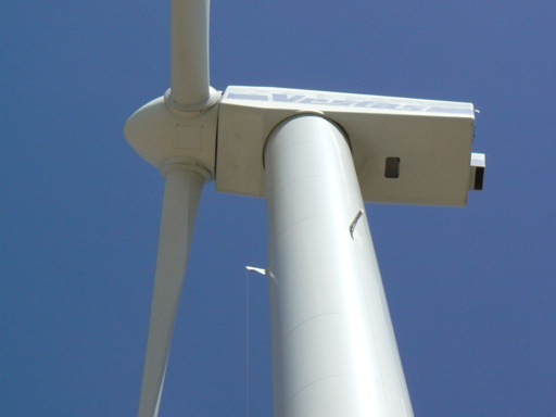
Gwen and I visited her folks in Lubbock over the 4th of July weekend. I make no excuses for Lubbock: I don’t think it has much going for it. One thing it does have going for it is flat, open space and wind. Lots of wind. As it happens, it’s in a wind-farm region that’s growing from Abilene to Amarillo. It’s also home to the Windmill Museum, a fitting institution for that town, and our visit to that museum was probably the most interesting part of the trip. If you find yourself in Lubbock, you should go.
They’ve got a lot of old-fashioned pumping windmills of the sort that sprout over farms all over the country—showing considerable ingenuity, variation, and beauty in their design—but they’ve also got a working 660 kW wind turbine generator (see above, see also my flickr set) and a disassembled 1.5 MW wind turbine. We actually had a chance to step inside the tower of the 660 kW turbine.
We learned a lot, including all the basic facts and figures for the generating turbines. The guy running the place once worked in the wind farms of southern California, where the turbines only generate about 200 kW each. Most of the turbines being installed today generate 1.5 MW, enough to power 500+ homes. Apparently electricity-generating windmills have been around since the 1880s, but it was only in the 1970s that they became economically viable—I asked what happened then and (as I suspected) it was a breakthrough in fiberglass fabrication that made much larger windmills possible. Each blade on the 1.5 MW turbine is 112 feet long and weighs 12,000 lb; the actual generator is of a size that would probably fit in the bed of a pickup, but at 14,000 lb or so, would overwhelm it. The farmers in the area renting land to the wind-turbine operators get $10,000/yr in rent plus a 2% royalty on each unit, so they should be making out pretty well even in a year with a bad harvest.
I’ve pulled the trigger on this theme. Come and get it. At the last minute, I figured out how to present the monthly archives in calendrical form, a trick I’m fairly pleased with.
I’ve updated the theme for my blog, Harder Better Faster Stronger. If things look funny, please reload.
I do not have this update available for download just yet—I want to shake it down in my regular blog for a few days before making it publicly available.
There are only a few visible changes. I’m using Helvetica instead of Lucida Grande for the typeface. I’ve added gravatar support. I hope I’ve made things a little more consistent and harmonious.
A lot has changed under the hood. I’m now using Blueprint CSS (with customized metrics courtesy of this generator). Getting this to work right without hideous kludges required a fair amount of tinkering, and resulted in me learning a bit about WordPress’ inner working and a bit more PHP.
Please let me know if you run across any obvious design bugs.