2015

Adventures in car-shopping

About a month ago, Gwen was rear-ended in a hit-and-run. She was fine. The car wasn’t.

Our car is a 2002 model, and the damage was extensive enough that our insurer doesn’t consider it to be worth repairing. They’ll let us keep the car and give us a payout that is considerably less than blue book for the car in its pre-crunched condition, or scrap it and give us the salvage value in addition to that payout. It’s been mechanically well-maintained, is still perfectly drivable, and is repairable. We can probably sell the car–even in its current condition–for more than salvage value.

The options we are considering are

  1. Continue to drive the car as-is.
  2. Fix the car and continue to drive the car.
  3. Sell the car and apply the money toward the downpayment on a new or new-to-us car.

So we recently made a list of all the cars that we think might serve our needs and wants, and yesterday we went for test drives. A lot of test drives.

We hit five dealerships and drove a total of nine different cars.

Dealerships

Dealerships are funny. Each one had a completely different vibe.

Honda

We started at Honda, and the dealer we met with there had been in car sales for a long time, was friendly and talkative and generally pretty sympatico. Some of that was probably an act, or a knack for finding something in each person to relate to. He spent a good few minutes with us before we went out on a test drive, asking what we were interested in, and also spent a lot of time selling us on the dealership, which I thought was a little weird. Once we did get in the car, had an established routine that he clearly liked to follow. The dealership was physically huge and had an elaborate system of storing car keys in a vault. The place had the aura of a well-oiled machine.

Volkswagen

The experience could not have been more different than at Honda. Not in a bad way. While the Honda dealership was sophisticated and heavy on procedure, the VW dealer asked us what kind of car we wanted to drive, pulled it up, and gave us the keys. Didn’t ride along with us, didn’t even make a copy of our licenses. We could have driven off to Mexico. The dealer answered our questions but didn’t put any of the sell on.

Mazda

We had a very young and green dealer who only learned how to drive a stick after he started selling cars, about six months ago. He was clearly following a script and had a hard time getting off of it, even when we told him what didn’t apply to us. He was the only guy who said “I need to talk to my manager,” and kept us waiting kind of a long time while he did that.

Ford

The only woman we dealt with in our shopping adventure. It became apparent pretty quickly that Ford didn’t have anything that would work for us, but she humored us anyhow. She also had the most classic patter of salesman bullshit I’ve ever heard–reciting stuff that was maybe not exactly false, but mischaracterized so dramatically that it might as well be, and pitched in a way that it shows she assumes the customer is an idiot who can’t see through any of it.

Subaru

Despite being owned by the same company that owned the Honda dealership, this one seemed casual in terms of their internal procedures. At one point we asked to test-drive a certain model, and the dealer helping us came out with a handful of keys to try. At one point I made a comment about “not buying anything today” and the dealer got defensive about not applying any pressure. Which he didn’t.

Cars

The only category that really interests me is the compact wagon, and it’s almost nonexistent in the USA, where the SUV has almost completely eclipsed it. So we wound up looking at other things that were compact, seemed wagon-ish, and got good mileage.

Honda HRV

This model is new to the USA, and one I hadn’t heard of until my sister mentioned that she was considering getting one. It’s built on the Fit platform, and is a micro SUV. I am extremely reluctant to buy anything that might be mistaken for an SUV, but this was pretty benign. Gets good mileage, very civilized to drive, nice interior. The second-most cargo space of anything we drove. Gwen’s favorite of the cars we drove.

Honda Fit

Surprisingly good for such a small car, but doesn’t have enough cargo space for us. I was especially impressed by the linear acceleration with the CVT.

VW Golf Wagon

I’m intrigued by the diesel, but it costs more than the gas version, and because of the amount we drive, it would take us 12 years to break even with its increased fuel efficiency. This has the most cargo space of anything we looked at, struck me as the most luxurious in terms of ride and cabin appointments, and the most solid build quality. The diesel version gets the best mileage of anything we looked at. My favorite by a long stretch, but also the most expensive thing we looked at by a fair margin.

Mazda3

Fun to drive and seems like a good value but we want more cargo space. If they made a wagon version of this, it would be a contender.

Ford C-Max

Gwen’s feet couldn’t touch the floor when she had the driver’s seat adjusted so she could actually drive it. We didn’t make it past that.

Ford Focus

Chintzy, not enough cargo space. Good looking from the outside though.

Ford Focus ST

A hoot to drive. Powerful engine, firm ride. This is a real sleeper of a sports car and I like that. Poor mileage. Like its plain Focus sibling, not enough cargo space and still chintzy. Hilariously, it pipes a pre-recorded “throaty engine growl” into the cabin when accelerating.

Subaru Crosstrek

Tried both the manual and CVT version: the CVT is actually better, which is not something I expected to discover. Compared to the other cars we drove, this felt slightly dated, and the drive quality was uncouth without being fun.

Smartphones, image processing, and spectator sports

I’ve done a couple of translations recently that focus on wireless communications, and specifically mention providing plentiful bandwidth to crowds of people at stadiums. Stadiums? That’s weirdly specific. Why stadiums in particular?

My hunch is that this is an oblique reference to the 2020 Tokyo Olympics. OK, I can get that. 50,000 people all using their smartphones in a stadium will place incredible demands on bandwidth.

Smartphones are already astonishingly capable. They shoot HD video. Today’s iPhone has something like 85 times the processing power of the original. I can only wonder what they’ll be like by the time the Tokyo Olympics roll around.

So what would a stadium full of people with advanced smartphones be doing? Probably recording the action on the field. And with all that bandwidth that will supposedly be coming online by then, perhaps they’ll be live-streaming it to a service like Periscope. It’s not hard to imagine that Youtube will have a lot of live-streaming by then as well.

This by itself could pull the rug out from underneath traditional broadcasters. NBC has already paid $1.45 billion for the rights to broadcast the 2020 Olympics in the USA. But I think it could be much, much worse for them.

In addition to more powerful smartphones, we’ve also seen amazing image-processing techniques, including the ability to remove obstructions and reflections from images, to correct for image shakiness, and even to smooth out hyperlapse videos. Youtube will stabilize videos you upload if you ask nicely, and it’s very effective. And that’s all happening already.

So I’m wondering what could be done in five more years with ten or so smartphones distributed around a stadium, recording the action, and streaming video back to a central server. The server could generate a 3D representation of the scene, use the videos to texture-map the 3D structure, and let the viewer put their viewpoint anywhere they wanted. Some additional back-end intelligence could move the viewpoint so that it follows the ball, swings around obstructing players, etc.

So this could be vastly more valuable than NBC’s crap story-inventing coverage. It might be done live or nearly live. It would be done by people using cheap personal technology and public infrastructure. The people feeding video to the server might not even be aware that their video is contributing to the synthesized overall scene (read your terms of service carefully!).

If that happened, the only thing you’d be missing would be the color commentary and the tape delay. Smartphones could kill coverage of sporting events.

Of course, the Olympics and other spectator sports are big businesses and won’t go down without a fight. At the London Olympics, a special squad of “brand police” [had] the power to force pubs to take down signs advertising “watch the games on our TV,” to sticker over the brand-names of products at games venues where those products were made by companies other than the games’ sponsors, to send takedown notices to YouTube and Facebook if attendees at the games have the audacity to post their personal images for their friends to see, and more. What’s more, these rules are not merely civil laws, but criminal ones, so violating the sanctity of an Olympic sponsor could end up with prison time for Londoners. Japan could do much the same in 2020. But if these videos were being served by a company that doesn’t do business in Japan, the show could go on. More extreme measures could be taken to block access to certain IP addresses, deep-packet inspection, etc. Smartphones could use VPNs in return. It could get interesting.

Flipside essays

For Burning Flipside 2015, the organization had some tickets left over after the normal ticket distribution. We decided to sell these in what I call a “bonus round,” but we decided that anyone who wanted one of these tickets needed to demonstrate some commitment. Our normal ticket-distribution process is kind of a pain in the ass. Without including some hoops to jump through, access to a ticket in the bonus round ticket would be easier than in the normal distribution, and would give the appearance of rewarding flakiness. So for the batch of tickets that I sold in the bonus round, I required that requesters “write me an essay about what you hope to get out of the experience. If you have been to Flipside, you can write about what you hope to get out of this year that you haven’t experienced before, or write about an experience you had that was particularly meaningful to you.”

Following are the essays that I have permission to share, anonymized when requested.

Old-school information management

Applied Secretarial Practice

I recently picked up the book “Applied Secretarial Practice,” published in 1934 by the Gregg Publishing Company (the same Gregg of Gregg shorthand). It’s fascinating in so many ways—even the little ways that language has changed. Many compound words were still separate, e.g. “business man.” The verb “to emphasize” seemingly did not exist, and is always expressed as “to secure emphasis.” And the masculine is used as the generic third-person pronoun rigorously, even when referring to secretaries, who were universally women at that time.

There’s a whole chapter on office equipment, most of which is barely recognizable today, of course. The dial telephone was a fairly recent innovation at that time, and its use is explained in the book.

But what really strikes me is that, out of 44 chapters, 8 are on filing. You wouldn’t think that filing would be such a big deal (well, I wouldn’t have thought it). You would be wrong. What with cross-references, pull cards, rules for alphabetizing (or “alphabeting” in this book) in every ambiguous situation, different methods of collation, transfer filing, etc, clearly, there’s a lot to it.

It got me thinking about how, even though I have pretty rigorous file nomenclature and folder hierarchies on my computer, I’m not organizing my files with anything like the level of meticulous care that secretaries back then practiced as a matter of course. For the most part, if I want to find something on my computer (or anywhere on the Internet), I can search for it.

And that reminded me of a post by Mark Pilgrim from years ago, Million dollar markup (linking to the Wayback Machine post, because the author has completely erased his web presence). His general point was that when you control your own information, you can use “million dollar markup” (essentially metadata and structure) to make that information easier to search or manipulate; a company like Google has “million dollar search” to deal with messy, disorganized data that is outside their control. Back in 1934, people had no choice but to apply million-dollar markup to their information if they wanted to have any hope of finding it. The amount of overhead in making a piece of information retrievable in the future, and retrieving it, is eye-opening.

Consider that to send out a single piece of business correspondence, a secretary would take dictation from her boss, type up the letter (with a carbon), perhaps have her boss sign it, send the original down to the mailroom, and file the copy (along with any correspondence that letter was responding to). It makes me wonder what would have been considered a reasonable level of productivity in 1934. I’ve already sent 17 pieces of e-mail today. And written this blog post. And done no extra work to ensure that any of it will be retrievable in the future, beyond making sure that I have good backups.

Colors

Translating a document that involves optics, I ran into what I immediately recognized as ROYGBIV in Japanese:

紫、青、水色、緑、黄、オレンジ、赤

(actually that’s VIBGYOR, but the point is the same)

I had never really stopped to consider how ROYGBIV might be expressed in Japanese, but it’s an interesting question, because the Japanese word that is ordinarily rendered in English as “blue”, 青 ao, can mean blue or green. “Vegetables” in Japanese can be 青物; a green light is an 青信号. And here it’s being pushed further down the spectrum, away from green, to stand for “indigo.”

The color that holds blue’s place in the above list is 水色, “water-colored.”

And that makes me wonder, what is the color “indigo” anyhow? How is it different from blue? Why do we have two color words for what’s basically the same thing? Apparently I’m in good company—according to Wikipedia, Asimov said “It is customary to list indigo as a color lying between blue and violet, but it has never seemed to me that indigo is worth the dignity of being considered a separate color. To my eyes it seems merely deep blue.” Wikipedia has quite a bit more to say about the color indigo: “According to Gary Waldman, ‘A careful reading of Newton’s work indicates that the color he called indigo, we would normally call blue; his blue is then what we would name blue-green or cyan.'”

Curiouser and curiouser. It seems as if 青 would be a good fit for Newton’s usage of blue, and ç´º would correspond better to indigo, but it’s also interesting to observe how the meaning of simple color words has apparently shifted in English. And 水色 is a pretty good fit for what Newton meant by “blue.”

The Wikipedia article is also interesting in that it explains why there are seven colors in ROYGBIV in the first place, when our modern color models are based on three primary colors (RGB or CMY) with secondaries and tertiaries in between: it was an arbitrary decision to force the colors to correspond with the seven notes of the Western musical scale.

Showing lots of options in Contact Form 7

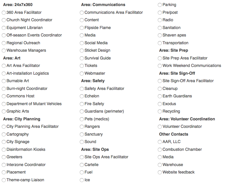
Contact Form 7 is a widely used WordPress plugin that offers a fair amount of flexibility, but I needed for it to do something it didn’t want to do: I wanted to display a form with a lot of options and make it look good. Normally one would do this using radio buttons or a dropdown menu. Because scrolling through long dropdown menus is especially annoying, I opted for radio buttons. But then I wound up with a long blob of radio buttons I wanted something with some structure: columns and headings.

CSS to the rescue. The following is not perfect (there are some limitations on selectors that prevented me from getting as fancy as I wanted), but I consider it a big improvement.

First, use the “Generate tag” option to create a radio button. Set an ID for the radio-button set. In this example, it is recipientlist. Enable the “Wrap each item with <label> tag?” option. This CSS is dependent on the tagging that option produces. You could rewrite this to work the other way, but it’s friendlier to turn that on anyhow.

Second, create your list of options. You probably want to do this in a text editor, not the CF7 editing window. Organize your options into sections, and insert new lines with section headings where appropriate. Begin each section with the same word–in the example shown below, I’m using “Area”. If you’re using piped options, it doesn’t matter what comes after the pipe for these section headings. Paste your completed list into the “Choices” field

Third, gank the following CSS:

<style>#recipientlist {
display: block;
-webkit-columns: 3 150px;
-moz-columns: 3 150px;
columns: 3 200px;
}
#recipientlist .wpcf7-list-item {
display: block;
margin: .25em 0;
}
.wpcf7-list-item input[value^=Area] {
display: none;
}
.wpcf7-list-item input[value^=Area] + .wpcf7-list-item-label {
font-weight: bold;
}</style>

and paste that right into the CF7 “Form” field, right at the top. Change #recipientlist to whatever ID you are using for your button set. Change Area to whatever you are using as the lead-in text for your section headings. Do not introduce any extra line breaks into this, as WordPress will add tags that you don’t want. Do not try inserting this into your theme’s styles.css document or via other style-injecting mechanisms, as parts of this will get overridden and you will be sad.

Your radio-button tag should look something like this:

[radio recipient id:recipientlist use_label_element *lots of options follow*…]

Copy that code and paste it wherever you think it belongs in your form. The style element should be at the top though.

You may want to play around with the number and width of columns, depending on your theme and the content you’re presenting.

Here’s a before and after.

Before:
before

After:
after

This isn’t perfect–there’s no way to control where the column breaks occur, or to show the sections as blocks of equal height. And it’s not semantically correct HTML. But it’s an improvement.

[Nerd mode=on]
There are four CSS rules here. The first one forces the set of buttons to show as a separate line, and breaks it into columns. The second forces each button to display on its own line. The third picks up buttons that begin with the section-identifying word “Area”; hiding the radio button and setting some margins. The fourth styles the label text for those section heading buttons.
[Nerd mode=off]